
If your customers don’t understand your product, they won’t buy it. And in digital marketing, confusion is the silent deal-breaker that wrecks sales funnels.
The problem here is that many marketers get so wrapped up in clever campaigns, jargon-filled messaging, or highlighting every single feature that they lose sight of what their audience actually needs: clarity.
Clear communication isn’t just a “nice-to-have.” It’s the backbone of a sales funnel that works. It keeps prospects moving from curiosity to conversion without hitting a wall of questions or second guesses.
In this blog, we’ll break down straightforward tactics to communicate your product’s value in a way that builds trust, simplifies decision-making, and drives action. We’re sharing these strategies because they’ve consistently delivered results for businesses across various industries, time and time again.
Keep Your Value Proposition Simple and Clear
A simple, clear value proposition is one of the most powerful tools in your sales funnel. It’s the first thing your audience looks for when deciding if your product is worth their time. If your message is vague or overly complicated, they’ll move on without a second thought.
Studies show that concise, well-crafted value propositions can increase conversion rates by up to 30%. That’s a big win for your bottom line.
So, how do you get it right? Start by answering three key questions:
- What problem do you solve?
- Who do you solve it for?
- What makes you better than the alternatives?
Once you’ve nailed those answers, refine your statement until it’s short enough to stick in your audience’s mind. Use plain language—no buzzwords or industry jargon. And make it about them, not you. Instead of talking up features, focus on the results your customers will get.
Now, here’s a brand that’s a prime example of this tactic in action—Somewhere, a platform specializing in outsourcing remote employees. Their value proposition says it all: “We find you amazing employees that cost 80% less than US equivalents.”
In just 12 words, they convey what they do, who they help, and why it’s a no-brainer for businesses looking to cut costs without sacrificing quality.
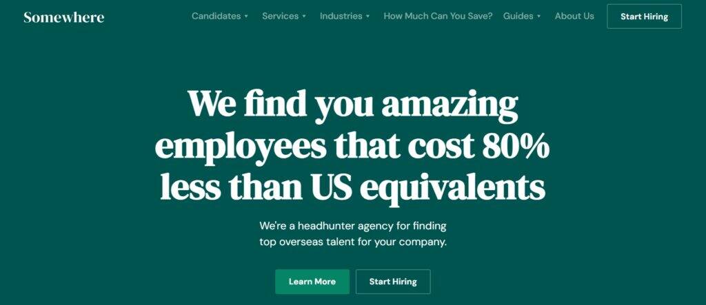
Source: somewhere.com
As you can see, a clear value proposition simplifies your buyer’s journey. It helps potential customers quickly grasp why your product fits their needs, giving them the confidence to move forward and making your sales funnel work that much harder.
Showcase an Explainer Video Early in the Visitor’s Journey
In today’s fast-paced digital world, attention spans are short, and your visitors want information quickly. That’s why showcasing an explainer video early in the buyer’s journey is such an effective tactic.
In fact, 78% of people say they’d rather watch a short video than read text to learn about a product or service.
A well-placed video helps your audience understand your offer in seconds, giving them the clarity they need to stay engaged and move deeper into your sales funnel.
Here’s how to do it right:
- Keep it short and focused.
Aim for a length of about a minute, and make sure the video highlights your product’s core benefits, not every tiny detail. - Make it visually engaging.
Use a mix of animations, on-screen text, and a friendly voiceover to keep viewers’ attention. - Place it strategically.
Your explainer video should be one of the first things visitors see (ideally above or just below the fold on your homepage).
A great example of this strategy is Rosie, an AI answering service that helps businesses streamline customer interactions.
On Rosie’s homepage, their explainer video sits prominently just below the header. It introduces the service, explains its benefits, and shows potential customers exactly how it works, all in a matter of seconds.
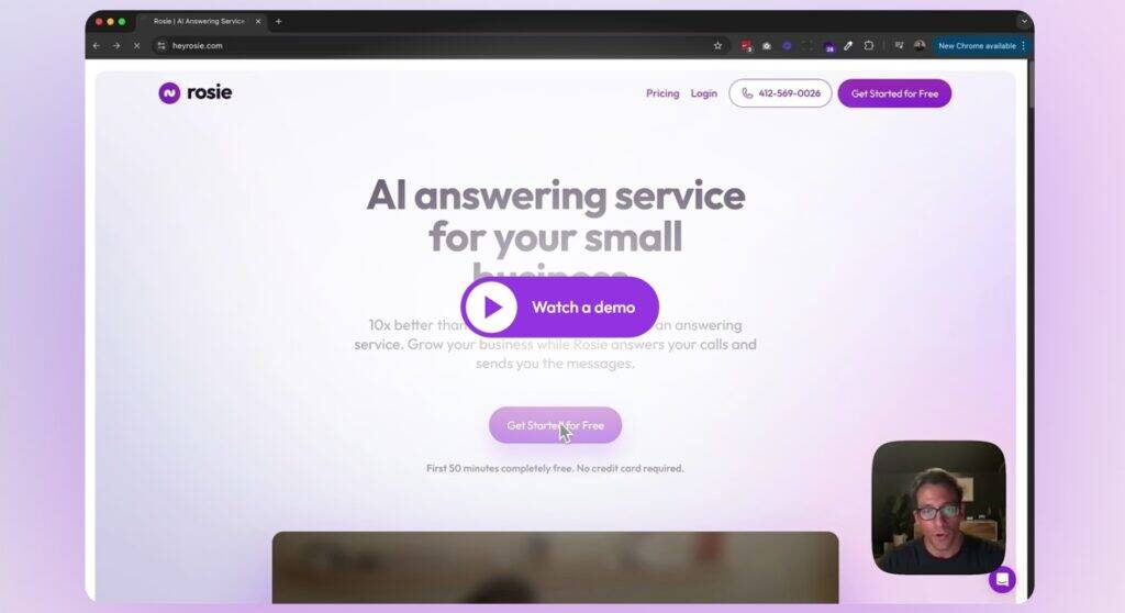
Source: heyrosie.com
By placing the video front and centre, Rosie ensures that visitors can quickly grasp what they offer and how it solves their problem. The result is a smoother buyer’s journey that keeps prospects engaged and more likely to convert.
Enable Instant Access to Core Product Functionality
In a world of endless options, first impressions matter—and your prospects want proof that your product works before committing.
That’s why enabling instant access to your core functionality is a game-changer. It lets visitors experience the value of your product firsthand, eliminating guesswork and building confidence.
By removing barriers like lengthy signups or overwhelming demos, you shorten the buyer’s journey and keep potential customers engaged.
Here’s how to do it effectively:
- Make it frictionless.
Allow visitors to access your core feature without needing to create an account or fill out a lengthy form. If a login is necessary, keep it quick and easy. - Highlight it prominently.
The functionality should be visible as soon as visitors land on your site (ideally in or near your homepage header). - Focus on instant results.
Choose a feature that provides immediate value or solves a specific problem, so prospects can see the impact right away.
Topview, an AI-powered video generator tool, executes this strategy perfectly. On their homepage, visitors can immediately test the service by inserting a prompt into a field that’s clearly labeled for this purpose.
After completing a simple sign-up process, the platform generates a sample video, instantly giving the lead an impression of the product’s capabilities. This approach showcases the platform’s various applications upfront and gives potential users a reason to trust and explore further.
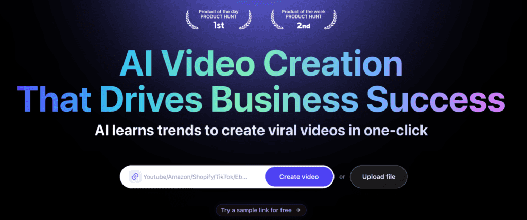
Source: topview.ai
So, allow your visitors to try your product right away and create a seamless experience that aligns with their needs. That way, you’ll keep your sales funnel flowing.
This is a simple yet effective way to show why your product is worth your customers’ time.
Tell Customer Success Stories
Stories sell, especially when they come directly from your customers. Featuring customer success stories is one of the most effective ways to build trust and move prospects through your sales funnel.
Seeing a relatable customer persona succeed with your product makes it easier for potential buyers to picture their own success. In that context, case studies and testimonials can improve conversion rates by up to 300%.
To do this right:
- Choose relatable personas.
Highlight customers who reflect the challenges and goals of your target audience. This creates an instant connection and makes the story more impactful. - Use specific results.
Showcase measurable outcomes that demonstrate how your product solves problems and delivers real value. - Vary the format.
While written case studies work, videos featuring real clients are even more compelling. Hearing someone speak about their experience in their own words builds credibility and trust. - Place them strategically.
Feature your success stories in high-visibility areas, like your homepage, landing pages, or email campaigns.
Transitions Elite, a company that helps veterinarians navigate the process of selling their practices, excels at this approach.
Their homepage prominently features video testimonials from satisfied clients who share their experiences. The videos highlight how Transitions Elite’s expertise and tailored solutions made a complex process smoother and more rewarding.
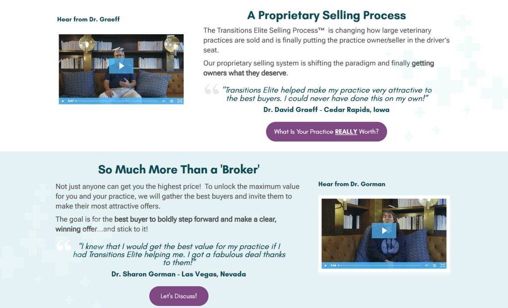
Source: transitionselite.com
By weaving these stories into their sales funnel, Transitions Elite provides proof of their value while addressing potential concerns. It’s a simple yet powerful way to inspire confidence and encourage prospects to take the next step.
Communicate Selling Points With Relatable Metrics
Numbers speak louder than words, especially when it comes to building trust and confidence in your product. Using relatable, easy-to-understand metrics to communicate your selling points makes your offer feel more credible and tangible.
Research-backed metrics cut through skepticism and help prospects make informed decisions, which can accelerate their journey through your sales funnel.
Here’s how to nail this method
- Choose metrics that matter.
Highlight results or benefits that are directly relevant to your audience’s goals or pain points. For example, focus on percentages, time savings, or measurable improvements that resonate with your target market. - Be specific and transparent.
Avoid vague claims. Instead, tie your metrics to concrete research, testing, or customer data. Include context where possible to increase credibility. - Keep it relatable.
Use metrics that are easy for your audience to grasp without requiring a scientific background. Simplicity is key. - Showcase metrics where they count.
Feature them prominently on product pages, landing pages, and ads, especially where visitors are weighing the decision to convert.
Armra, a brand selling natural colostrum supplements, is a master of this tactic. On the product page for their Immune Revival Blood Orange Jar, they use clinically proven metrics to back their claims.
These measurable benefits, based on rigorous scientific research, reassure their health-conscious audience that the product is both effective and trustworthy.
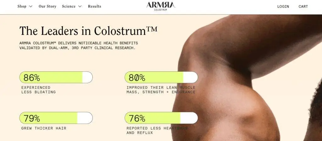
Source: tryarmra.com
This demonstrates that presenting relatable, research-backed data can transform customer hesitation into confidence.
This tactic not only enhances credibility but also aligns perfectly with the audience’s need for transparency and proof, helping the sales funnel perform at its best.
Encourage Instant Human Contact
For some products or services, human interaction is more than helpful—it’s essential. This is especially true for those with higher stakes or complex decision-making.
Encouraging instant human contact ensures prospects can ask questions, get personalized advice, and feel supported before making a commitment.
This approach eliminates confusion, builds trust, and removes friction in the sales funnel. In fact, for industries like legal services or high-ticket consulting, that human touch can be the deciding factor for conversion.
Here’s how to get this approach right:
- Use intelligent CTAs.
Include calls-to-action that nudge visitors toward a conversation, such as “Talk to an Expert” or “Get Free Advice.” These should stand out and clearly explain the next step. - Simplify forms.
Don’t overwhelm visitors with lengthy fields. Ask for just enough information to start the conversation and handle the rest once contact is made. - Be approachable.
Use friendly, non-intimidating language and visuals. Displaying a real person’s photo or name can make a huge difference in humanizing the interaction. - Place it prominently.
Make instant contact options visible where they’re most needed, such as on the homepage, pricing pages, or any point where potential customers might hesitate.
Christensen Law, a personal injury law firm, implements this perfectly. Their website features an intuitive contact button in the lower left corner, where a real person invites visitors to start a conversation.
When clicked, it opens into a simple, smart form for instant contact. This human-first approach makes the firm feel approachable and reassures potential clients that help is just a click away.
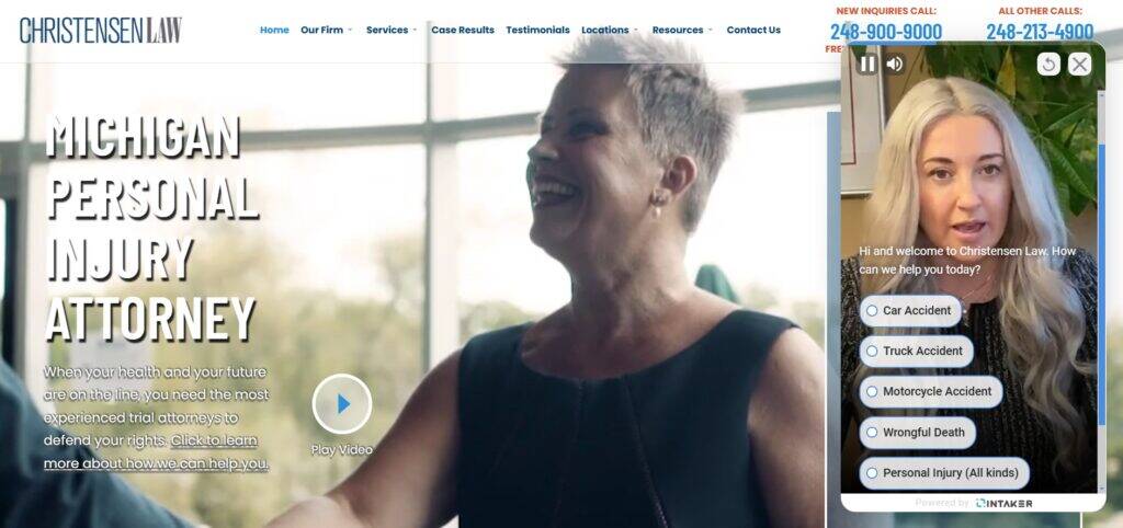
Source: davidchristensenlaw.com
If you encourage instant human contact, you’ll be able to reduce barriers to conversion, provide clarity, and make prospects feel valued. These are all vital for moving them through the buyer’s journey.
Show How Your Product Measures Up Against Alternatives
When customers are considering your product, they’re also likely evaluating other options. By showing how your product measures up against alternatives, you help prospects make an informed decision and highlight why you’re the best choice.
This strategy clarifies your value proposition while preempting objections and eliminating doubts. Side-by-side comparisons are particularly effective in competitive markets where prospects feel overwhelmed by choices.
Here’s how to effectively compare your product to your competitors:
- Be transparent.
Provide an honest comparison that highlights your strengths without misleading or exaggerating. Prospects value authenticity, and trying to hide your shortcomings can backfire. - Focus on what matters most.
Identify the features or benefits that are most important to your target audience, and emphasize those in your comparison. - Make it visual.
Use tables, charts, or infographics to display the comparison in an easy-to-scan format. The clearer the information, the better. - Place it where it’s relevant.
Comparison pages work well as standalone landing pages, but can also be linked in blog posts, ads, or emails targeting competitors’ audiences.
ClickUp, a project and task management platform, nails this tactic. Their comparison landing pages pit ClickUp against competitors like Monday, a similar platform.
They include a detailed table showing shared features and areas where ClickUp outperforms. This positions ClickUp as a superior choice while educating prospects on their full feature set.
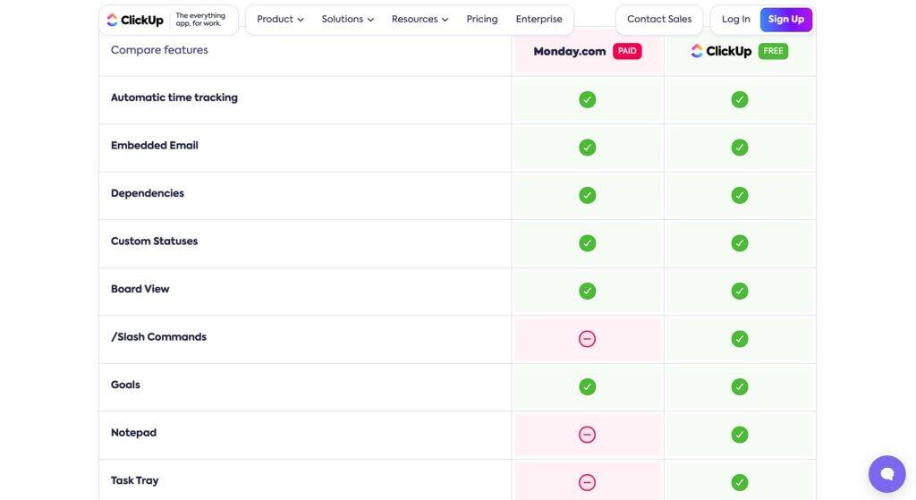
Source: clickup.com
Follow this example and show how your product stacks up. That way, you’ll simplify the decision-making process and build trust, giving your prospects the confidence to move forward in your sales funnel.
Final Thoughts
Clarity is the foundation of a successful sales funnel. Every step your prospects take should feel intuitive, informed, and purposeful.
The strategies we’ve shared are proven ways to remove friction and guide your audience toward confident decisions. The question is: are you ready to take action? Because the clearer you make your messaging, the faster your business will grow.
Your next step starts here: simplify, connect, and communicate with intention. The results will speak for themselves.
For the latest digital marketing news, check out our blog. To book an appointment, call 866-208-3095 or contact us here.


