
To Grue or Not To Grue
Perspectives from The Artist’s Road

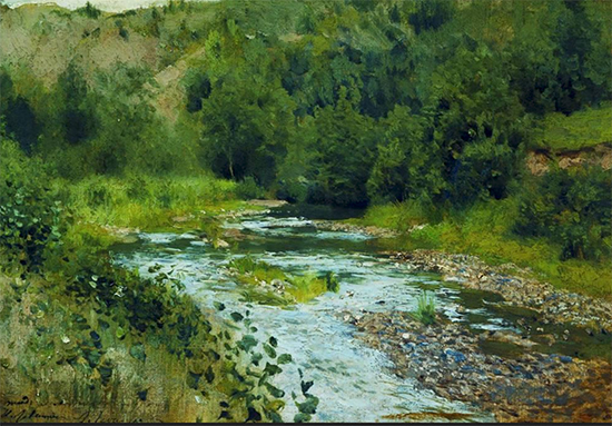
A River 1888 Isaac Levitan
From time to time, I have been told by collectors and gallerists alike that people don’t like green paintings very much. That may be occasionally so, but my past sales of green paintings would indicate it is not a universal bias. Still, why would anti-green bias exist at all?
I’ve been reading a delightful book on the subject, Full Spectrum, by Adam Rogers. He lays out the centuries of scientific and physiological research behind our human perception of color. Daylight, which is made of photons in both particle and wave flavors, creates a broad colored spectrum of light we perceive as white, but of course, it is not only that. We see just the small spectrum of it which our eyes are equipped to see. The larger portion of the light spectrum is invisible to us, but it is still there in daylight. We know this because clever scientists have figured out how to measure this white light, both visible and invisible, as distinct wavelengths. Those wavelengths help us to conceptually recognize colors as a thing, a quality, a portion, if you will, of light.
As it turns out, the way we are able to talk about a thing, both defines and changes how we perceive that thing. Language becomes color as talk of color enters our language. Not too long ago, there were civilizations who did not have a word for blue. They saw it in the sky and the sea, but they had no common way to communicate the concept of blue, so they didn’t pay much attention to it in the things they created. Even today, with all the shades of green and blue pigments we have, the colorspace of green-blue, or grue, always takes second seat to the warm, intense colors in the human lexicon. There are fewer words overall for that color space, versus the warm colors, so people don’t talk about them as much or consider grue very important. Using twenty-thousand images of everyday things, Microsoft trained their Artificial Intelligence Large Language Models to pick out objects from a background and describe them. Those objects, by and large, were mostly warm colored. Now that’s just weird. Or, I should say, wired, because it seems our brains also work that way.
Ted Gibson, a language researcher at MIT, and Bevil Conway, a neurobiologist, color researcher and artist working at the NIH, study how humans see, categorize and talk about color. By studying diverse language speakers, including an isolated, primitive tribe, they discovered that everyone had more difficulty communicating colors in the grue space than the warm color spaces. Our brains are biased, biologically to prefer warm colors so we create more words for them. “That’s a more primitive, fundamental, backbone universal color categorization”, Conway says. He continues, “This is the main, first-order terminology we use to talk about pigments and their importance in painting”. The researchers developed a theory that greens and blues are typically perceived as backgrounds to the warmer-colored objects— humans, flowers, animals, berries and fruits in front of them. They are not the main subjects, warm-colored objects are preferred for that role.
Something interesting to think about while we’re making paintings of the natural world around us!
Copyright Hulsey Trusty Designs, L.L.C. (except where noted). All rights reserved.


![Comic Book Series [Letter M]](https://som2nynetwork.com/wp-content/plugins/phastpress/phast.php/c2VydmljZT1pbWFnZXMmc3JjPWh0dHBzJTNBJTJGJTJGc29tMm55bmV0d29yay5jb20lMkZ3cC1jb250ZW50JTJGdGhlbWVzJTJGcmVodWItdGhlbWUlMkZpbWFnZXMlMkZkZWZhdWx0JTJGbm9pbWFnZV8zMzZfMjIwLnBuZyZjYWNoZU1hcmtlcj0xNzQxMjk5MjI3LTEwMjQmdG9rZW49MmNlY2Q5ODk5NTE3ZDYyYQ.q.png)
