


Screen reader: Accessible email header
As you can hear, there’s quite a difference!
How to code accessible tables for email layouts in Litmus
If there’s one aspect of accessible coding you take away from this article, it’s adding role=presentation to your tables. This will dramatically impact your accessibility and takes very little time to do.
“Doing this is so important because it lets screen readers know that they don’t need to read it out like a table,” says Carin. “I came up through email in a very regulated industry, and everything had to look a certain way, so I often would use tables or bullet points in the code to do that. Those are both important cases for ARIA labels to let a screen reader know that it’s not actually meant to be read that way.”
Here’s how to do it in Litmus:
1. First, log in to your Litmus account and click on Litmus Builder. Choose from one of your templates or start coding your email directly with HTML.
2. As you build your tables, add role=presentation.
3. When you’re done, double check your work in the QA checks tab in Builder. Litmus Accessibility Checker can help you identify exactly what you’re missing with dozens of helpful accessibility checks.
4. Then, update your Previews and QA tab to finish your testing process.
5. Send it! *happy dance*
4. Use semantic elements to structure your content
Semantic elements make it easy to highlight content hierarchy, showing subscribers (and screen readers) what’s a headline and what’s paragraph copy. Including semantic elements gives your subscribers who use screen readers the option to “scan” through an email more easily.
When double checking your copy, make sure any headline-worthy copy is enclosed within an
5. Left-align your copy, if possible
When it comes to your body text, it may be tempting to center align. However, when it comes to accessibility, this is a big don’t!
When you center your text, the starting edge changes for every line, which forces your subscribers to work harder to find the beginning of each line. That’s a challenge for people with dyslexia and other reading impairments.
If you have any copy that’s longer than two lines, left-align that copy. This is especially important for mobile, since the narrow width often produces more lines of text than you may realize. You may need to left-align your text responsively on mobile.
6. Check the contrast of your copy
Check the contrast ratio of your text colors against the background colors of your email. You may have subscribers that have color deficits, and if your colors do not provide enough contrast for them, they may not be able to read your email. There are two ways you can check your contrast ratio:
If you need to manually input your color codes, check out https://contrast-ratio.com/.
Dodging accessible coding mistakes
Of course, we all make mistakes. Here’s a quick shortcut so you can easily fix your code:
| Common Accessibility Error | Fix It By… |
|---|---|
| All-image emails | Adding images where necessary within the code of your email |
| No ALT Text | Adding descriptive alt text to each image. |
| Poor color contrast or disappearing text in dark mode | Choosing a color scheme that has high contrast. Think opposite sides of the color wheel. |
| No text alignment | Left-aligning your copy text. This makes it much easier for screen readers (and tbh, everyone.) |
| Disorganized code | Adding role="presentation" to your tables, and semantic elements like
,
, or (Plus it’s cleaner code for you!) |
Unlock endless revenue
Let’s take a look at how much email-driven revenue you could be leaving on the table.

Coding for dark mode
Litmus Market Share shows 35% of emails are opened in dark mode, making it a potentially significant chunk of your subscribers. Since it launched in 2018, it’s created quite a few headaches for email marketers—especially when it comes to accessibility.
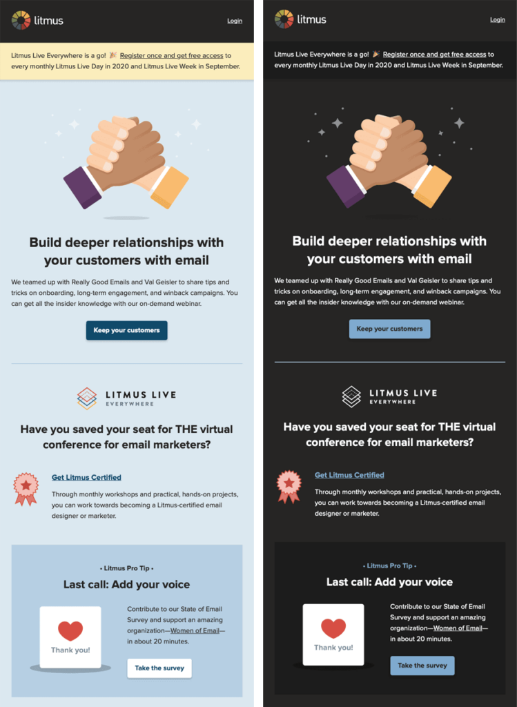
That’s because some email clients leave your email exactly as it is, some email clients completely invert your colors, and some only partially do.
To make sure any Dark Mode styles stay accessible to users—specifically, that your color contrast works and is readable to users with colorblindness or low vision, you can use two different methods to control what your email looks like:
- @media (prefers-color-scheme: dark)
This method works in very much the same way as applying a block of styles inside a @media query for your Mobile Responsive view, except this CSS block targets any user interface that’s set to Dark Mode. @media (prefers-color-scheme: dark) allows you to create the most robust custom Dark Mode themes where you can implement anything from Dark Mode-specific image swaps, hover effects, background images… basically almost anything you can do with traditional CSS. This method requires you to add Dark Mode meta tags and styles to the of your email in order to work in Apple Mail.
- [data-ogsc]/[data-ogsb]
S/O to Mark Robbins for showing us how to target the Outlook app. This method allows for image swapping on Outlook.com. To do it, duplicate the @media (prefers-color-scheme: dark) styles you already applied and add the appropriate [data-ogsc] prefixes to each CSS rule.
Coding accessible, interactive emails
Interactive emails are some of the most fun and challenging to create. Adding elements like polls, surveys, hot spots, quizzes, offer reveals, and reviews gives your subscribers a chance to engage directly with your email. With most of these types of interactivity, however, you need a fallback option or a generic version to make them accessible.
But one of our favorite underused interactive elements can actually help your accessibility efforts: Hover effects.
Coding accessible, interactive emails
Interactive emails are some of the most fun and challenging to create. Adding elements like polls, surveys, hot spots, quizzes, offer reveals, and reviews gives your subscribers a chance to engage directly with your email. With most of these types of interactivity, however, you need a fallback option or a generic version to make them accessible.
But one of our favorite underused interactive elements can actually help your accessibility efforts: Hover effects.
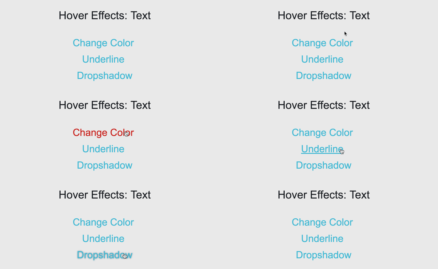
At Litmus, we use hover effects on our CTAs, links, and images to indicate clickability. Hover effects are a simple interactive element that can make your emails more engaging and improve your subscribers’ experience by making them easier to interact with.
Here’s how to do it:
Embed CSS
.txt-color:hover { color: #8ddaeb !important; }
HTML – Text Hover Color Change
Change Color on Hover
Though hover effects are only supported in AOL, Apple Mail, Gmail, and Yahoo! Mail, they’re a popular effect and worth implementing in your email code. You can fade an image, change the color of your CTA button, add a pop-up tab, and more.
Create emails that everyone can experience
Maximize your email’s impact by designing accessible content for all. Accessibility checks are always at your fingertips with Litmus.
Accessibly coding with email personalization
We often think of accessibility as an “extra” aspect of coding, but it’s really the foundation of personalization. You can’t build tailored experiences for your subscribers if they can’t read or click on your email to begin with.
“In email marketing, we talk a lot about 1:1 personalization, but true 1:1 communication is impossible if users can’t access your content,” says Lauren Castady, Associative Creative Director at Oracle Digital Experience Agency.
Merge tags pull in data from your ESP or database to personalize words, designs, or images in your email. But what a lot of email marketers don’t know is that merge tags work in ALT Text—so you can still add personalization from your images into your descriptions. For example, if you’re sending a “Happy Birthday [NAME]!” email, you can add an extra message for anyone unable to see those images.
“If you’re using a personalized image with someone’s name on it, like a birthday cake, don’t miss the ALT text. You can either add a merge tag for an extra layer of personalization or make the ALT text generic enough that it matches the message without losing the experience. It does take a bit more coding, but you can do it as long as you have that data in your ESP.”
Here are some examples to try:
Generic ALT text with a flexible fallback personalization parameter in the image

Personalized ALT text with a flexible fallback personalization parameter in the image
Engage with 1:1 experiences
Deliver personalized content at scale. Use live polls, dynamic content, and advanced targeting to drive results.
Tools for accessible and inclusive coding
Litmus’ Accessibility Checker, built directly into Litmus Builder and Litmus Previews, gives you visibility into important accessibility guidelines to meet the needs of the disabled community.
1. Automatic accessibility checks
Scan your email for 40+ accessibility areas, with detailed reports and guidance on any issues found. With Litmus’ Email Builder, you can check your code as you work to ensure it meets your subscribers’ needs.
2. Visual impairment filter
Make sure your email looks right against four different visual impairment filters mimicking different kinds of colorblindness, so you can double check design elements like color contrast, negative space, and font size.

3. NVDA screen reader preview
Our NVDA screen reader integration supports over 80 languages so you can make sure your email looks good and sounds good.
These tools are available in every single Litmus plan because we believe that creating more accessible, inclusive emails is an important part of making email marketing better for everyone.
Start making a difference today
Maximize your email’s impact with Litmus to ensure accessibility and inclusivity for all subscribers — no matter their abilities.

Kayla Voigt is a B2B Freelance Writer.
You might also like:
Blog
The ROI of Email Marketing [Infographic]
We surveyed hundreds of brands about their email marketing practices as well as the returns they get from the email channel. The result: unique insights into the factors that lead to higher email marketing returns—and actionable advice on how you can increase the email ROI for your brand, too.