
Following the completion of its planned merger with fellow South Korean carrier Asiana, Korean Air is poised to relaunch its branding and introduce a new aircraft livery to mark the rebirth of the newly expanded carrier. Pictures leaked online show the first aircraft to wear the new color scheme, a Boeing 787-10 landing at Seoul-Gimpo Airport (GMP) on March 10, 2025, ahead of the new branding’s official launch.
The new livery replaces the current scheme, which was first introduced almost 41 years ago on March 1, 1984, on one of the company’s Boeing 747-300 and a single McDonnell Douglas MD80, both types of which have been long-since retired from the carrier’s fleet. 41 years is a long time for an airline to refresh its branding, so the Asiana merger has given Korean Air the impetus to revisit its corporate image.
The current scheme being replaced was in itself a deviation from the traditional colors of the national flag, with a baby blue upper fuselage color separated from the white lower fuselage by a silver stripe. The airline’s ‘Taegeuk’ (yin yang) logo appeared on the tail in the traditional colors of red, white, and navy blue, while also appearing as the ‘O’ in the airline titles on the forward fuselage in what is now an old fashioned font style.

The livery being replaced, whilst still iconic in design, has slowly become rather dated as airlines have (albeit with exceptions) moved away from the widescale use of color, favoring predominant white fuselages with the sporadic use of color in fuselage titles and logos to break up the monotone appearance and to distinguish their aircraft from those of their competition. European carriers, in particular, have employed this approach with Lufthansa, Air France, Iberia, Aer Lingus, airBaltic, TAP Air Portugal, Brussels Airlines, SWISS, Turkish Airlines, Aegean, and LOT, all following the trend.
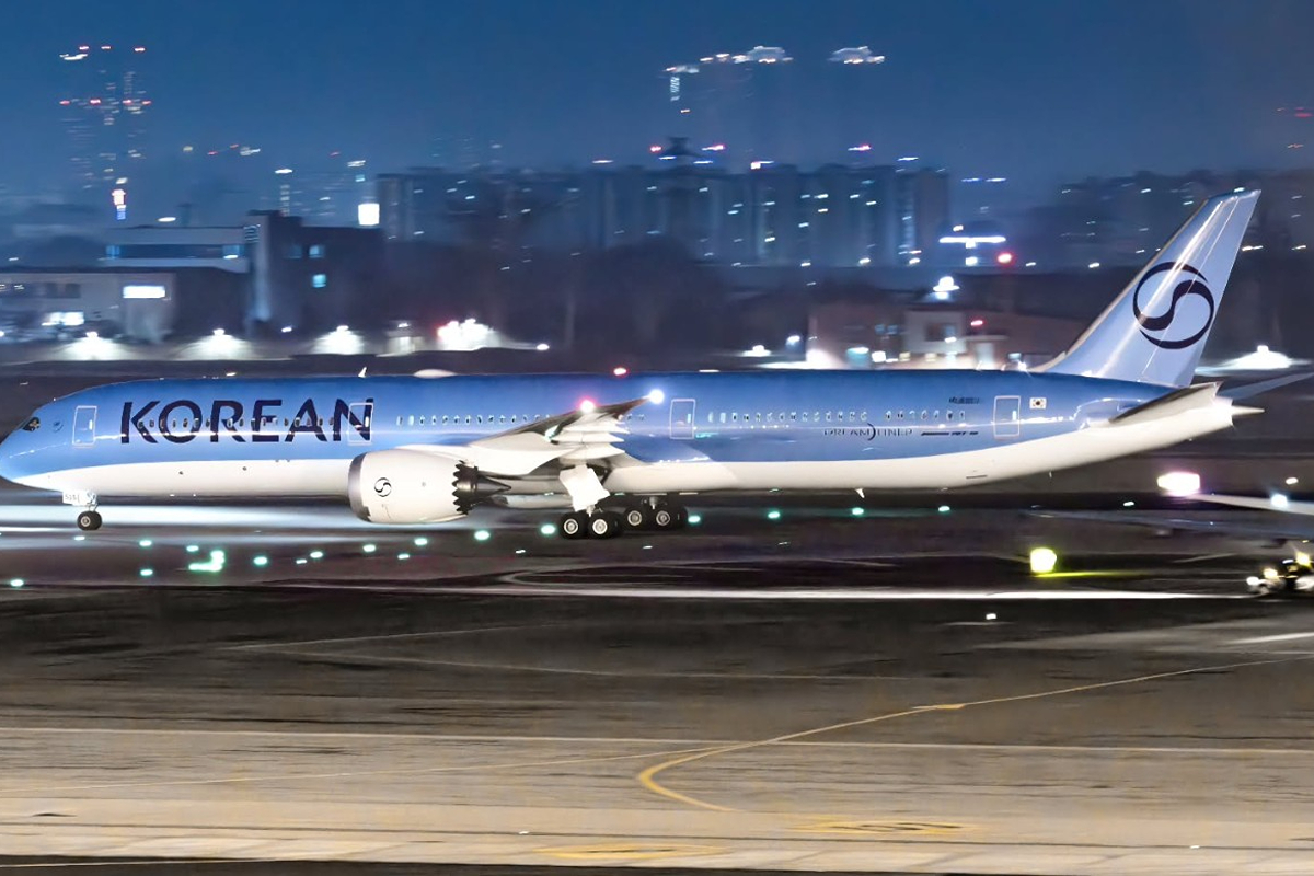
The new Korean Air scheme, as seen on Boeing 787-10 HL8515, appears to be a modern uptick on the current design that, while not moving entirely away from the themes previously featured across the fleet, provides an updated refresh on the current livery. Retaining the overall blue upper fuselage, the titles have been enlarged to encompass the forward window line, and then the font used has been modernized and now features a darker blue color palette. The word ‘Air’ has also been dropped, with the airline’s name simply presented as ‘Korean’.

The tail continues to feature the distinct Taegeuk pattern, although this has been simplified and stylized. The Taegeuk pattern is outlined in the same navy blue as the titles, with red no longer featuring anywhere in the new livery. Notably, the Taegeuk pattern and font used for the company name appear to be the same design as Hanjin Shipping Group, Korean Air’s holding company, and was originally registered with the Korean Intellectual Property Office in early 2022, according to Chosun Biz.
The aircraft featuring the new livery is one of Korean Air’s newest additions, having been delivered to the carrier in July 2024. According to airline tracking website Flightradar24, the plane last flew a commercial service for the carrier on February 23, 2025, from Fukuoka to Seoul, before positioning to Busan-Gimhae Airport (PUS) for repainting. Having received the new livery, the aircraft ferried back empty from Busan to Seoul-Gimpo Airport on March 10, 2025, ahead of the official launch ceremony, which is expected to take place on March 11, 2025.


