
Brussels Airlines is a brand that’s needed to get its dots in order. The airline has been going through a bit of an identity crisis which now seems to finally have settled into it’s smart retro-inspired shoes. Taking the recent ‘dots’ livery which seemed somewhat unrooted in its heritage or national image, the airline has finally given the livery and graphic treatment a real purpose.
In short the airline is not changing its logo, but it’s evolving almost everything else. In a move that sidesteps traditional rebranding efforts, the Belgian flag carrier has partnered with Antwerp-based creative studio WeWantMore to usher in a new era for the airline. This transformation trades corporate austerity for character and visual noise for subtle sophistication. The result is a brand evolution that focuses on emotion over aesthetics, reflecting what Brussels Airlines calls its “boutique hotel in the sky” ethos.

A New Chapter in Belgian Hospitality
Following the pandemic, Brussels Airlines unveiled a visual update in 2021 aimed at streamlining its image – in short, we weren’t sold. It was a huge departure from the existing brand, easily replicable and had no purpose. It felt overly generic, but not particularly memorable. What was missing was the warm, personalised charm that Belgium does so well. That’s where WeWantMore stepped in, tasked with elevating the brand from surface-level visuals to an all-encompassing experience.

Rather than overhaul the brand completely, the team retained its core elements — the logo, colour palette, and name — and focused on adding depth, texture, and emotional resonance. The new identity is centred around the guiding principle: “Small details. A world of difference.” This idea flows through every brand interaction, anchored by the brand essence: “You’re in good company.”
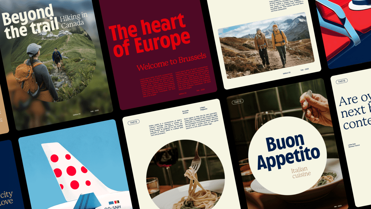
One of the most subtle yet transformative shifts is the reimagining of the airline’s signature dot motif. Previously part of its polkadot logo, the dot now serves as a flexible visual device. It gently draws attention to considered touch-points across the journey, from inflight menus and crew communication to environmental design in lounges. This is a smart interpretation of what is basically one of the most fundamental of shapes.
A custom typeface, Cirrus Sans, adds further distinction. Inspired by the golden age of aviation, the font brings a nostalgic modernity that pairs well with a newly refined colour palette. Together, these elements form a complete visual language that works across every touchpoint, from advertising and digital platforms to physical spaces onboard and on the ground.

More Than Just Surface Design
Where this rebrand truly succeeds is in its approach to identity as a living system. This isn’t a visual layer applied for consistency’s sake. It’s a cohesive ethos that runs through every interaction. Whether in employer branding, campaign materials, onboard communication, or even the airline’s television content, the tone and visuals are now unmistakably aligned. The brand feels premium in an understated, human way. Less showy, more considered. I personally love the fact the brand language is even extended to the animation metric, with speed and tone of motion carefully considered.
Brussels Airlines’ Head of Product and Brand Marketing, Michel Moriaux, explains, “This brand refresh isn’t just a cosmetic layer in advertising, but a truly premium identity that comes to life from cabin to lounge. We finally have a brand that resonates down to the smallest details and perfectly reflects who we are: human, welcoming, and Belgian with a playful twist.”
That spirit is also captured by WeWantMore’s Creative Director, Sebastien Greffe, who adds, “We couldn’t change the logo or the colours. But a brand is more than that. You don’t start with form — you start with an idea. We built a visual language, a system, a feeling. This isn’t a new outfit. It’s a living identity.”

As Europe’s airline landscape becomes increasingly homogenous, Brussels Airlines is carving out a more personal niche and it couldn’t come at a better time. This is not about being louder or flashier. Instead, the airline is speaking with quiet confidence and a distinctly Belgian accent. The design feels considered, crafted, and human. Less like a global airline, and more like a boutique retreat in the clouds.
This isn’t about branding, it’s about brand expression and this is a very strong example of visual storytelling. Explore the full case study at wewantmore.studio
As I do every year, I ask on your kind support to keep things going. If you are able to donate – whatever amount – it all gets funnelled back in to the site, to keep the site full of content. And I thank you personally for your kind support.


