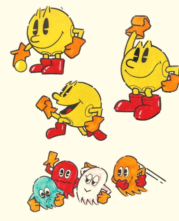
I recently came across a few interesting and previously unseen rejected artwork examples from the original cabinet design of Puck Man. So this week, I figured I’d do a follow up to the last blog entry about the Puck Man PCB, by sharing some of the great artwork originally created for the game’s release. You can read the previous article here.
Puck Man‘s artwork was created by Namco artist Tadashi Yamashita. He joined Namco as a student in 1969 after responding to an advertisement in a newspaper. One successfully landing the job, he mainly focused on designing artwork, logos, and typefaces for various Namco arcade machines.

His work on some of Namco’s videogames of the late 70s included Gee Bee, Bomb Bee, and Cutie Q.

In 1980, with several successful art contributions under his belt, Yamashita was approached by the Puck Man‘s designer Toru Iwatani.

To lift the simple pixel generated Puck Man character out of the screen and into the outside world, Namco artist Tadashi Yamashita created character illustrations, bringing the game’s hero to life.

I played a near complete version of Pac-Man during its development, which immediately brought an image inside my head. I got straight back to my drawing board and started the artwork. In terms of character design, Mr. Iwatani came to me with what was seemingly a near-finished game. It all came together with just a simple yellow circle for PAC-MAN and 4 different coloured ghosts. So, I worked on the design from there, quickly adding arms and legs to PAC-MAN’s circular body. The result was so simplistic that I felt it needed something to give it more character, so I added eyes reminiscent of a classic manga style. Oh, and by the way, the reason PAC-MAN has slits in his black eyes is because I designed his eyes to be an enlarged and elongated version of PAC-MAN’s design itself. No one seems to have noticed, but I think this not only gave him character, but gave the design some real impact.
These characters are scattered throughout the cabinet design. On the side art, marquee and bezel.
Yamashita has spoken about some of the specific design characteristics of the main character. Notice some of the edges around Puck Man are broken:

This is because when I drew the character with a unform thick line, it gave the impression of Puck Man as being heavily “closed”. Those gaps in the lines give the impression of movement.
He also shared an interesting insight into the design of Puck Man‘s eyes:

The reason PAC-MAN has slits in his black eyes is because I designed his eyes to be an enlarged and elongated version of PAC-MAN’s design itself. No one seems to have noticed, but I think this not only gave him character, but gave the design some real impact.
Here’s some early artwork created for the game:

Several Puck-Man posters were created and used in advertisements and in game centres across Japan. This one of Puck Man shouting into a microphone is probably the best known.


The original cabinet design is something to behold:

These sketches of the side art I mentioned at the top of this article are fascinating. They depict some of the rejected side art designs drawn by Yamashita, and show his thought process on the journey to coming up with the final artwork shown above:


Ultimately, it was the round version that was chosen to adorn Namco’s Puck Man arcade game release:


Of course, the release of the game in the West via licence with Midway, resulted in the change of name to Pac-Man.
Here’s a brief interview with Yamashita, to celebrate the 40th anniversary of the game in 2020.
Yamashita would go on to create the brand designs for future Namco classics including Rally X, Warp & Warp, Galaga, Pole Position and Xevious. The distinctive artwork created by Yamashita is a great reminder that to generate appeal, manufacturers of arcade cabinets in the 70s and 80s, realised that to attract players to play their games, they needed a complete package. The actual physical game and gameplay were one thing, but the artwork filled in the imagination gaps that might have otherwise passed players by.

I highly recommend checking out Tim Lapetino’s excellent book, Pac-Man: Birth of an Icon for further reading on the development and marketing of Pac-Man.
Thanks for stopping by this week!
Tony

