
It’s lunchtime, and you’re craving a burger. But when you walk into your favorite local joint, mouth watering at the smell of sizzling patties on the grill, you’re shocked to discover they’ve redesigned their menu. Instead of something crisp and easy to read, you’re handed a 19-page binder, half of which is written in Comic Sans, with items scattered across every other page. All you want is your usual, and you’re getting hangry.
This burger place is an example of how not to create a mega menu. If you make your website visitors wade through a jungle of disorganized categories, subcategories, and sub-subcategories, they’ll likely head for the exit.
When done correctly, however, a mega menu can help guide users straight toward what they’re looking for. It can be the difference between rummaging through a cluttered closet and stepping into a well-organized walk-in wardrobe — everything’s where you expect it to be, labeled and within arm’s reach.
In this article, we’re going to show you how to create the good kind of mega menu (no Comic Sans or 19-page overload). We’ll dive into practical tips, real-world examples, and best design practices to help you build a mega menu your visitors and search engines will love. If you’re ready to delight your users, boost your site’s discoverability, and maybe even give your competitors a little menu envy, keep reading.
A mega menu is a type of navigation menu that expands to show multiple columns and subcategories under broader headings. Instead of a simple dropdown listing a few links, a mega menu can lay out dozens of links, grouped by category and often enhanced with visuals like icons or product images.
Mega menus are good for user experience (UX) because they make it easier for visitors to see a clear overview of what your site offers, especially if you have a lot of product categories or blog topics. Having well-labeled and visually organized links means your site visitors can quickly locate the information or product they’re after, instead of rummaging through multiple clicks.
From an SEO perspective, mega menus can highlight your most important categories and pages, making it easier for search engines to understand your site structure. Internal links help to spread authority (sometimes called “link juice“) across key pages, which can boost their visibility in search results.
For small business owners especially, a mega menu can eliminate the clutter of an overgrown website and guide visitors toward the pages that matter most — from flagship products to blog content. That means fewer frustrated visitors and more conversions.
Benefits of Mega Menus
Before diving into design tips, it’s worth considering why you’d use a mega menu over a simpler dropdown. Here are a few of the major perks you should consider:
- Quicker access to important content: With columns and subheadings, visitors can instantly jump to different sections of your site. No more endless clicking through multiple nested layers.
- Reduced bounce rates: When users find what they need quickly, they’re more likely to stick around. A well-structured menu can encourage them to explore even further.
- SEO advantages: Each link in your mega menu counts as an internal link to that page. The more relevant internal links you create, the better search engines understand your content hierarchy, which has positive effects on your SEO efforts.
- Easier scalability: As your site grows — maybe you add new product lines or service categories — a mega menu can easily expand without breaking your design or user experience.
Together, these benefits can significantly improve how people (and search engines) engage with your content. For anyone running a business website, having more streamlined access to your products or articles via a mega menu can help drive both sales and brand loyalty.
When Should You Use a Mega Menu?
Not every site needs a mega menu. For example, a freelance writer with a simple three-page site (“Home,” “About,” “Contact”) probably won’t benefit from adding one. But if your navigation is looking like a labyrinth, a mega menu might be your (and your visitors’) saving grace.
Ask yourself these questions. If you answer “yes” to any of them, a mega menu might be the right choice for you:
- Do you have a large product catalog? Mega menus can be a good fit for e-commerce sites with varied product lines (for example, apparel, accessories, and subcategories for both).
- Does your site have multiple departments or sub-brands? If you manage separate business divisions and want to unify them under one domain, a mega menu can help you do so without overwhelming users.
- Do you have a blog that has complex categories? Sites covering various topics often need a central way to direct readers to specific sections — and a mega menu can accomplish exactly that.
- Do you often need to highlight promotions or seasonal offerings? Mega menus can spotlight limited-time sales or featured categories right in the navigation.
From a technical standpoint, you’ll want to make sure your theme or platform supports mega menus. WordPress, for example, offers several plugins (like Crocoblock or Spectra) that let you create fully customizable mega menus without coding. If you run a custom site, you might need a developer to help with HTML, CSS, and JavaScript to get the layout looking just right.
CSS
Cascading Style Sheets (CSS) is an essential coding language used for styling webpages. CSS helps you create beautiful pages by modifying the appearance of various elements, including font style, color, layout, and more.
Ready to create a mega menu that does more than just look fancy? These nine tips will set you up for success.
1. Keep It Simple and Intuitive
Overloading your mega menu with tons of links might seem helpful, but it can overwhelm visitors. Instead, group items thoughtfully and use headings to segment your content. That way, visitors can scan and find what they want quickly.
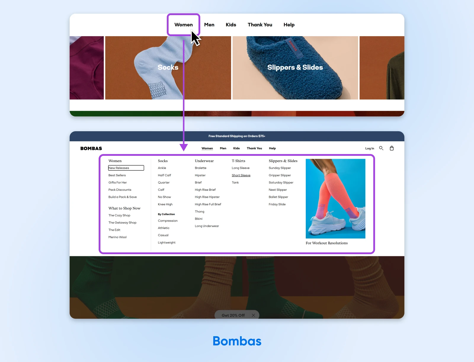
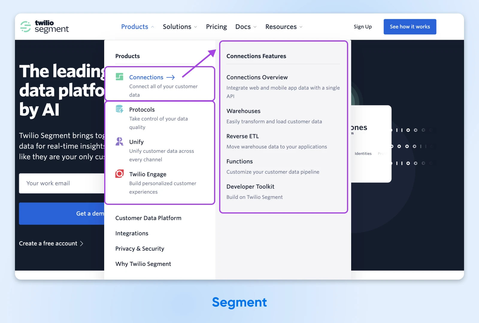
Segment does this well by grouping its products intuitively under clear headings to make them scannable and easy to navigate.
Pro Tip: Start by mapping out your site’s categories and subcategories on paper or a digital sketchpad. A rough “mind map” can help you see the bigger picture before you start designing.
2. Be Consistent in Your Design
Your mega menu should feel like a natural extension of your website’s theme. Match the color scheme, fonts, and general styling. This not only looks polished but also helps visitors feel they’re still on the same site.
Qualtrics is a good example of this. Notice how its mega menu fits the rest of the site with a similar color scheme and matching iconography.
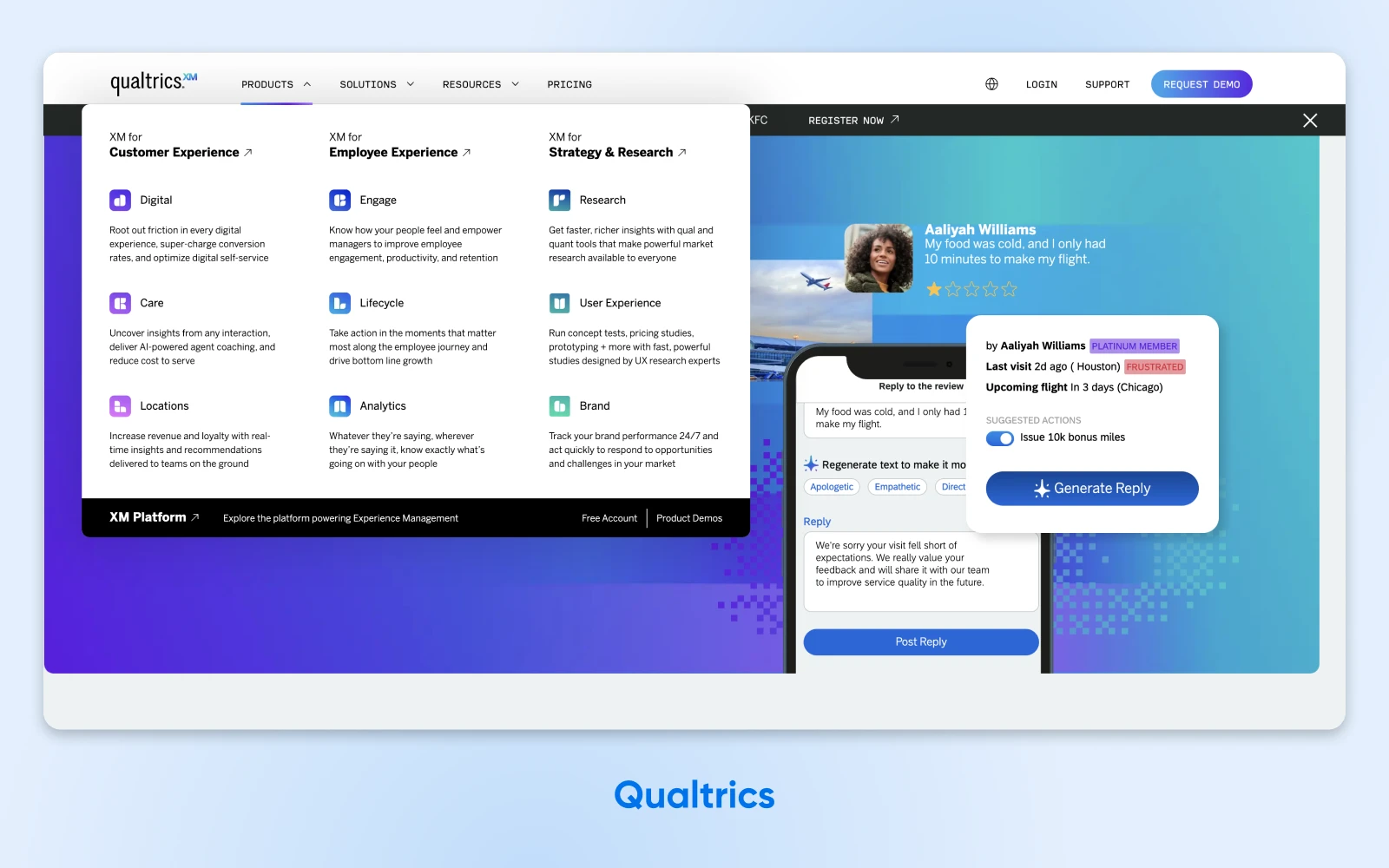
Why this matters: A jarring transition from your homepage to a mismatched menu design can cause confusion that breaks user trust.
3. Limit the Number of Levels
Depth is fine, but burying your content four submenus deep? Not so much. The further people have to drill down, the more likely they are to bounce. Aim for a structure where users can locate their desired page within two or three clicks.
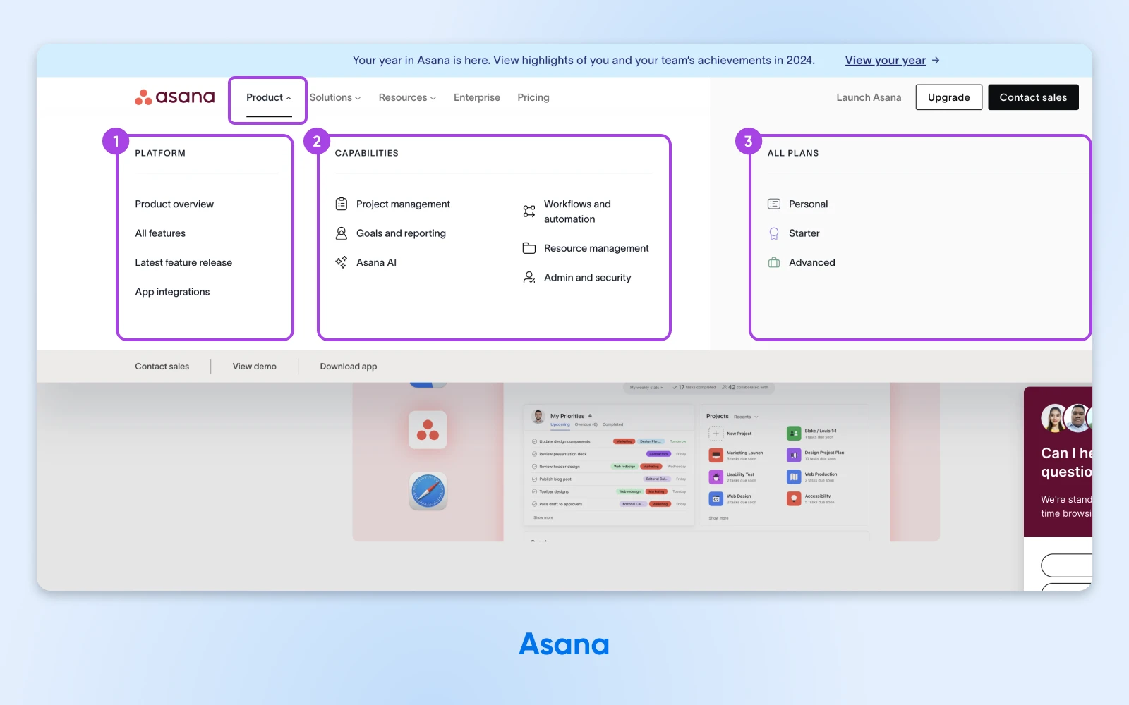
Asana does this well with a mega menu that goes deeper than a simple dropdown, but still keeps things simple, clean, and navigable.
Pro Tip: Check for over-nesting. If you can’t see all your subcategories at a glance, you might need to consolidate or rename some sections.
4. Use Clear, Descriptive Labels
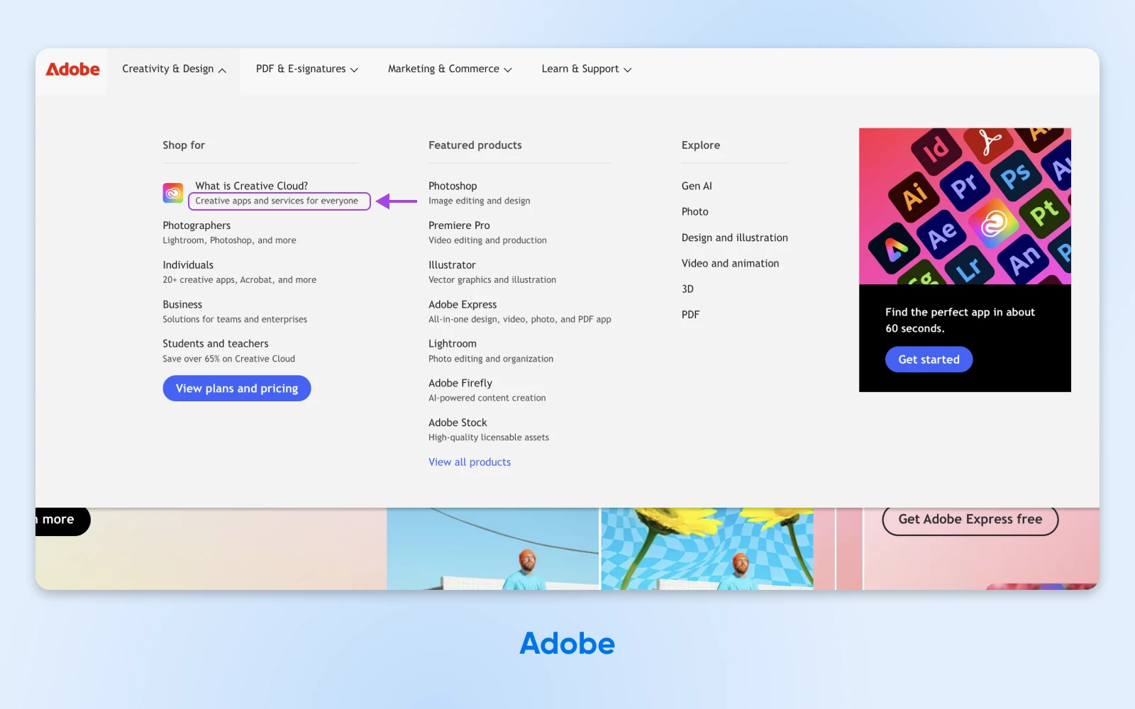
Avoid vague labels like “Misc.” or “Stuff.” Use terms your audience actually searches for (great for SEO, too!). A descriptive label like “Winter Jackets & Coats” is more helpful than just “Outerwear.”
Take a look at how Adobe does this, slotting the search term, “What is Creative Cloud?” into their mega menu:
Pro Tip: Integrate keywords if they make sense. Don’t force it, but if people often Google “Kids’ Winter Coats,” try to make that a label.
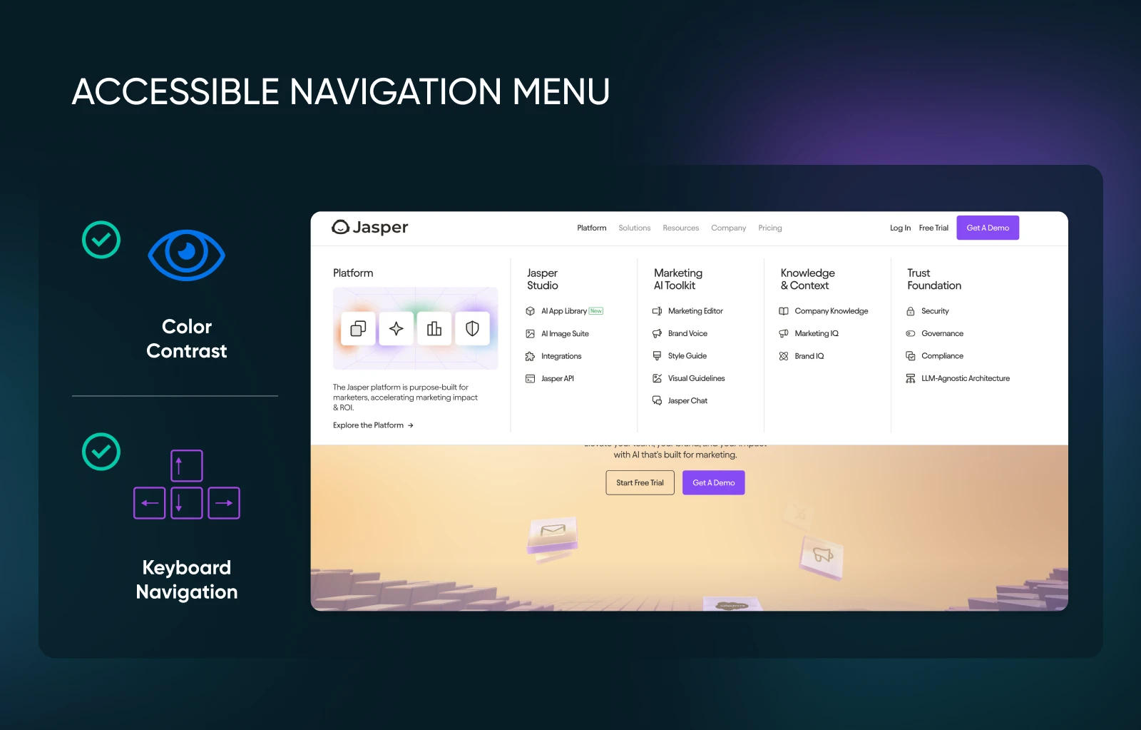
5. Optimize for Accessibility
An accessible mega menu isn’t just good practice; it can also expand your potential audience. Make sure keyboard navigation works properly, add accessible rich internet applications (ARIA) labels for screen readers, and build in adequate color contrast for users with visual impairments.
Jasper’s simple mega menu is also accessible —its color scheme uses the correct contrast and the entire menu can be navigated by keyboard:
Pro Tip: Test your menu’s accessibility yourself. Try navigating your site using only the Tab key. If you can’t reach certain menu items easily, it’s time to fix your keyboard accessibility.
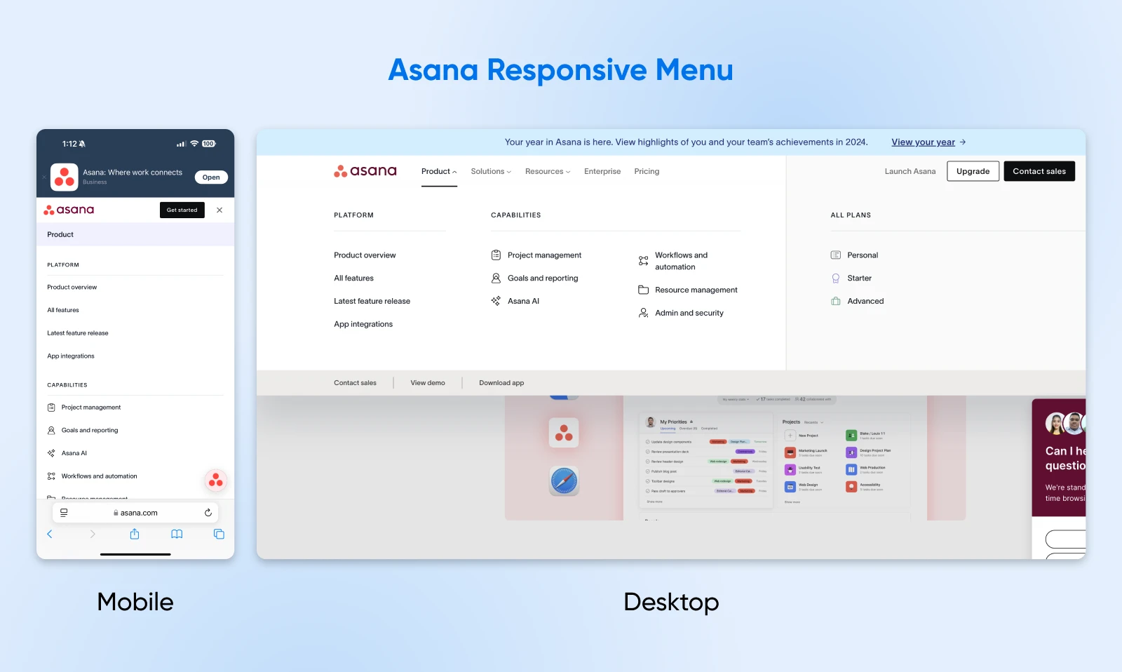
6. Make It Responsive and Mobile-Friendly
Your mega menu should adapt seamlessly to different screen sizes. On mobile, you might condense columns or switch to an accordion-style dropdown. However you handle it, make sure it’s easy to tap and scroll.
Note how Asana’s mega menu from desktop translates to the mobile version of their site. It still includes the same headers, but in a format that’s easy to scan and navigate on a smaller screen, so the UX translates easily.
Pro Tip: Design your mobile menu for thumbs. Buttons and links need enough padding, so visitors don’t accidentally tap the wrong link on a smartphone.
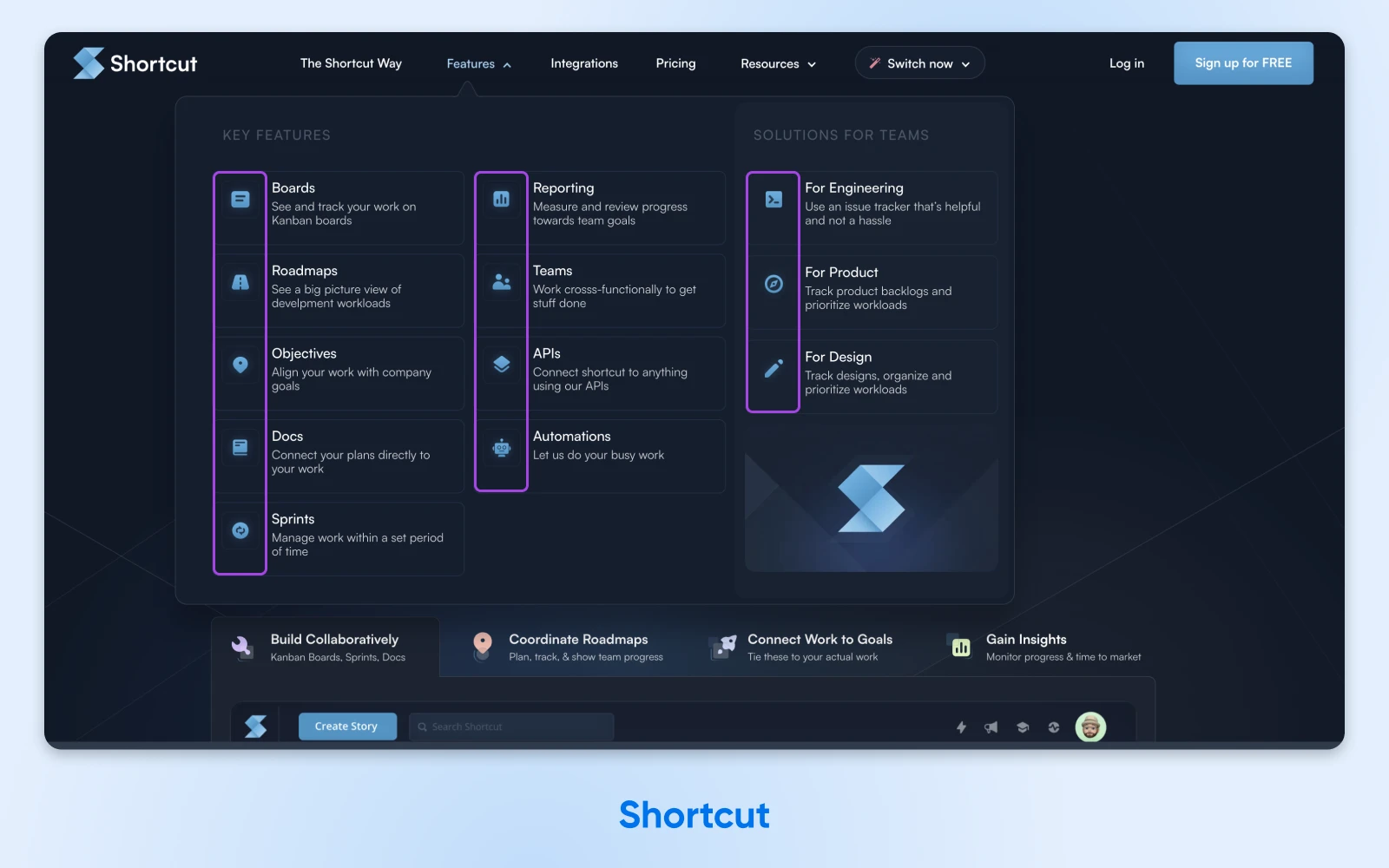
7. Include Visual Cues
Icons and small images can speed up recognition, especially if they align with your brand. For instance, use a camera icon for a “Photography” category or a small t-shirt graphic for “Apparel.”
Shortcut offers a good example of this. See how they use icons to illustrate each key feature in their mega menu? It adds visual interest and makes the menu easier for visitors to scan, which improves the overall UX.
Pro Tip: Use a visual hierarchy. Place the most important subcategories or promotions at the top or with a subtle color highlight.
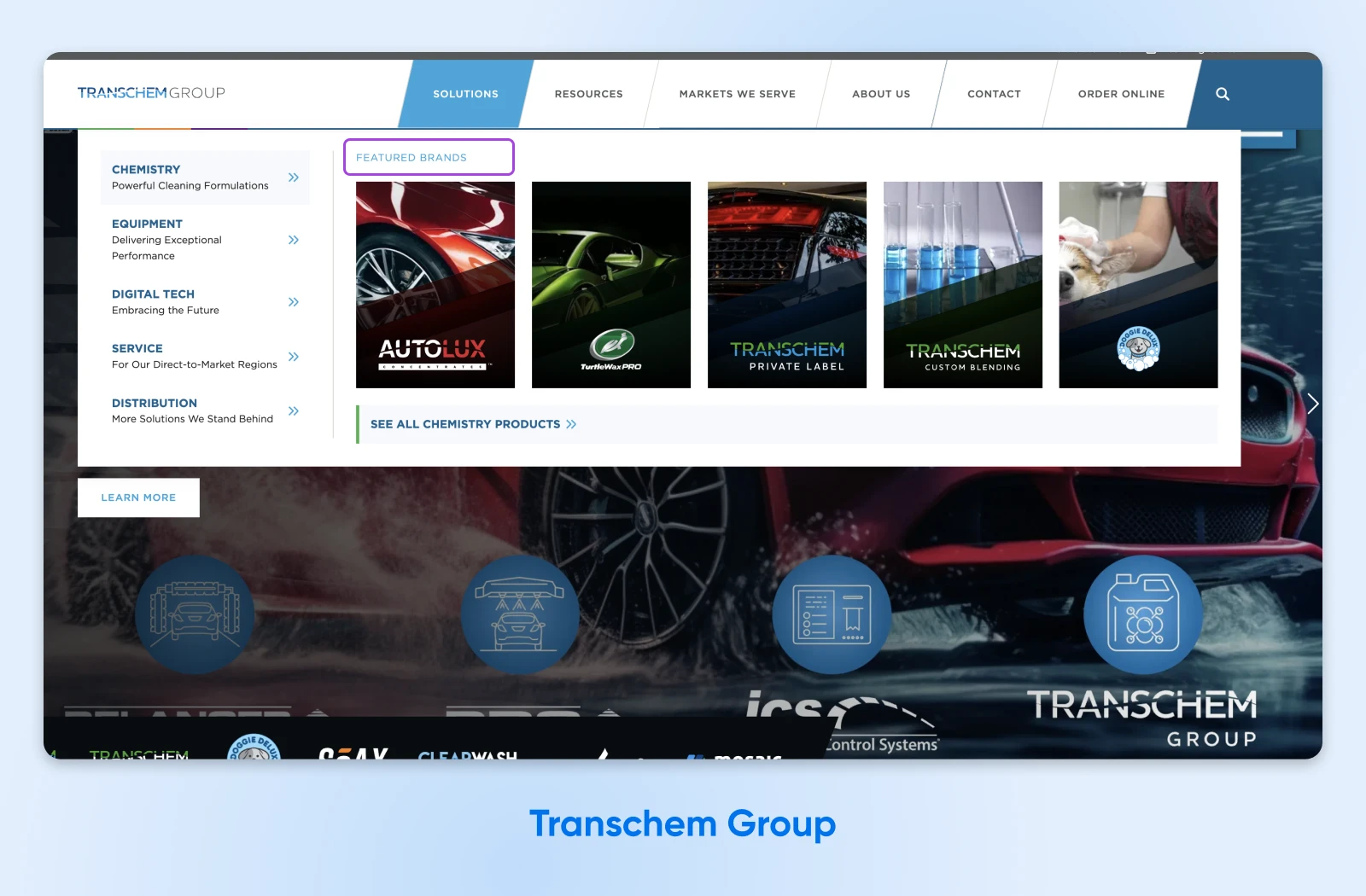
8. Prioritize Your Most Important Content
If there are pages you really want to drive traffic to (like new arrivals, top sellers, or a seasonal sale), give them prime real estate in your mega menu. It’s a great way to guide users toward valuable or timely content.
Take a look at how Transchem Group does this to highlight featured brands in their mega menu.
Pro Tip: Don’t overdo it. Prioritizing everything means prioritizing nothing. Instead, spotlight one or two special features.
9. Update and Review Regularly
Your website isn’t static, so your mega menu shouldn’t be either. Remove outdated links, add new categories as your business evolves, and keep an eye on any structural issues that might emerge.
Pro Tip: Put a quarterly or biannual “menu check” on your calendar to make sure everything’s still relevant and functioning properly.
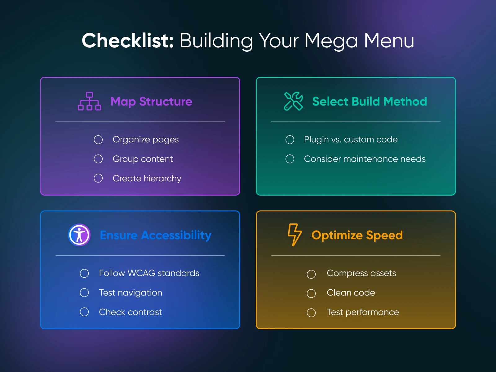
After you’ve planned out your mega menu structure, it’s time to bring that vision to life. Use this checklist as a roadmap to make sure no crucial step gets overlooked.
Step 1: Map Your Site Structure
A clear understanding of your website’s hierarchy lays the foundation for an effective mega menu. Mapping your site structure means identifying your main categories, their subcategories, and any top-priority links you want to feature.
What to do:
- Brainstorm or audit existing pages
- Group related content
- Create a visual outline
Step 2: Choose a Plugin or Custom Solution
Your method of implementation affects not just the look of your mega menu, but also its performance, customization options, and ease of maintenance.
What to do:
- Decide how you’ll implement your mega menu (ex. WordPress plugin or theme, native menu builder, custom code, etc.)
Step 3: Make Your Menu Accessible
An accessible mega menu means all visitors — including those with disabilities — can navigate your site efficiently. Plus, many accessibility practices align with SEO best practices, making your site more discoverable.
What to do:
- Use guidelines like the Web Content Accessibility Guidelines (WCAG) to audit your menu
- Add descriptive ARIA attributes
- Use large enough text to read comfortably
- Use contrasting background and font colors
- Test your mega menu by using only the Tab key to navigate
Step 4: Optimize Performance
A mega menu that looks stunning but takes too long to load could drive visitors away before they even see it. Also, page speed is a search engine ranking factor, so performance directly affects your SEO efforts.
What to do:
- Minimize images using tools like TinyPNG or ShortPixel
- Use efficient code; avoid unnecessary scripts or frameworks
- Load scripts conditionally
- Run speed tests with Google PageSpeed Insights or GTmetrix after implementing your mega menu
Even the most careful planning can go awry if you stumble into these common navigation missteps. Here’s what can derail an otherwise great mega menu:
1. Overcrowding
Some site owners try to squeeze in every link they have, hoping to give visitors “more choices.” But when everything is in one place, people can get overwhelmed.
Here’s how to avoid it:
- Limit subcategories: If you find over 10 links per category, consider whether you can simplify or combine categories.
- Use clear headings: Rather than listing 20 links under “Blog,” group them by topic (for example, “Tutorials,” “Industry News,” “Case Studies”) for easier navigation.
2. Poor Labeling
Lack of clarity or heavy use of internal jargon can confuse users who aren’t familiar with your terms.
Avoid it by:
- Speaking your visitors’ language: If visitors commonly search for “handbags,” don’t label that category as “carryalls” (unless you can back it up with powerful brand messaging).
- Using descriptive, SEO-friendly labels: Think about commonly searched phrases that match your content or products.
3. Ignoring Mobile Users
Some site owners focus on desktop design and forget that mobile users often have limited screen real estate and rely on touch interactions.
Avoid this pitfall by:
- Considering responsive or adaptive design: Test your mega menu on multiple phone sizes.
- Condensing columns wisely: If you have a four-column layout on desktop, maybe reduce it to two columns or an accordion layout on mobile.
4. Performance Issues
Visual flair or large images can slow your site down, leading to impatience (and high bounce rates).
Here’s how to mitigate performance problems:
- Compress media: Use smaller images or placeholders in your menu.
- Use lazy load features: If you’re displaying product images in the menu, consider loading them only when the user hovers or clicks.
5. Neglecting Accessibility
Site owners sometimes build menus without screen readers or keyboard navigation in mind, focusing only on how the menu looks. This can cause navigation and readability issues for site visitors with disabilities.
Here’s how to avoid this pitfall:
- Plan for accessibility from the start: Incorporate ARIA roles, test tab navigation early, and use robust color contrast in your menu design.
- Periodically audit your menu: Best practices for web accessibility sometimes change, so keep up to date with guidelines like the Web Content Accessibility Guidelines (WCAG) and check your menu against them periodically.

Once your mega menu is live, how do you confirm it’s improving user experience and SEO? The best way is to keep tabs on a few key metrics and analyze user behavior.
Metrics To Track
- Bounce rate: If users can quickly find relevant pages, they’re less likely to leave immediately. A decrease in bounce rate is a good sign.
- Pages per session: More page visits suggest the menu is guiding users deeper into your site.
- Click-through rates (CTR): Track which menu items get the most clicks. If crucial links are underperforming, revisit your labeling or positioning.
- Time on site (or average session duration): If visitors spend more time browsing after implementing your mega menu, you’ve likely improved your navigation.
Tools To Use
- Google Analytics: A staple for monitoring traffic patterns, setting up goals, and tracking events (like menu clicks).
- Heatmap tools: Show you visually how visitors move their mouse and where they click.
- A/B testing platforms: Help you experiment with different menu layouts, color schemes, and labels to see which configuration resonates best.
Analyze and iterate
Data alone doesn’t fix problems — you need to interpret it.
Look for patterns such as:
- Frequently clicked links: These show potential areas to expand or highlight even further.
- Ignored links or sections: This might mean the items are mislabeled, uninteresting, or tucked away where nobody sees them.
- Differences between the mobile and desktop versions of your menu: If some menu items are popular on desktop but ignored on mobile, consider if your mobile layout needs adjustments.
Continuous improvement is the name of the game. Use insights from your analytics to make incremental changes, test again, and refine.
A well-structured mega menu can transform the way visitors experience your site. Instead of fumbling through hidden links or dense drop-downs, they enjoy a user-friendly layout that surfaces exactly what they’re looking for. Better UX means happier visitors — and happier visitors often translate to more sales, sign-ups, or page views.
At DreamHost, we understand that website optimization isn’t just about speed and uptime — it’s also about how well you organize and present your content. Whether you’re running a small e-commerce shop or a content-rich blog, a killer mega menu can help you reach your goals faster.
So what’s next? Based on what you’ve learned in this article, here are the next steps you can take:
- Plan your mega menu structure: Use the steps above to map out categories and subcategories in a way that makes sense for your audience.
- Pick a platform or plugin to use to build your own mega menu: Choose a solution that’s accessible, easy to maintain, and fits your site’s style.
- Implement and test your own mega menu: Go live, then gather data on user behavior.
- Refine your mega menu: Tweak labels, layout, or visuals based on the metrics you collect.
And if you need assistance with hosting, website-building tools, or general optimization tips, DreamHost is here to help. We offer everything from fully managed WordPress solutions to expert guidance on performance and design best practices. We can help you build a fast, reliable WordPress site that delivers a standout user experience — mega menu(s) included.
Ready to dive in? Check out DreamHost’s hosting solutions today, and get your mega menu up and running knowing you have a reliable partner every step of the way.

DreamHost Makes Web Design Easy
Our designers can create a gorgeous website from SCRATCH to perfectly match your brand and vision — all coded with WordPress so you can manage your content going forward.
This page contains affiliate links. This means we may earn a commission if you purchase services through our link without any extra cost to you.
Did you enjoy this article?


