
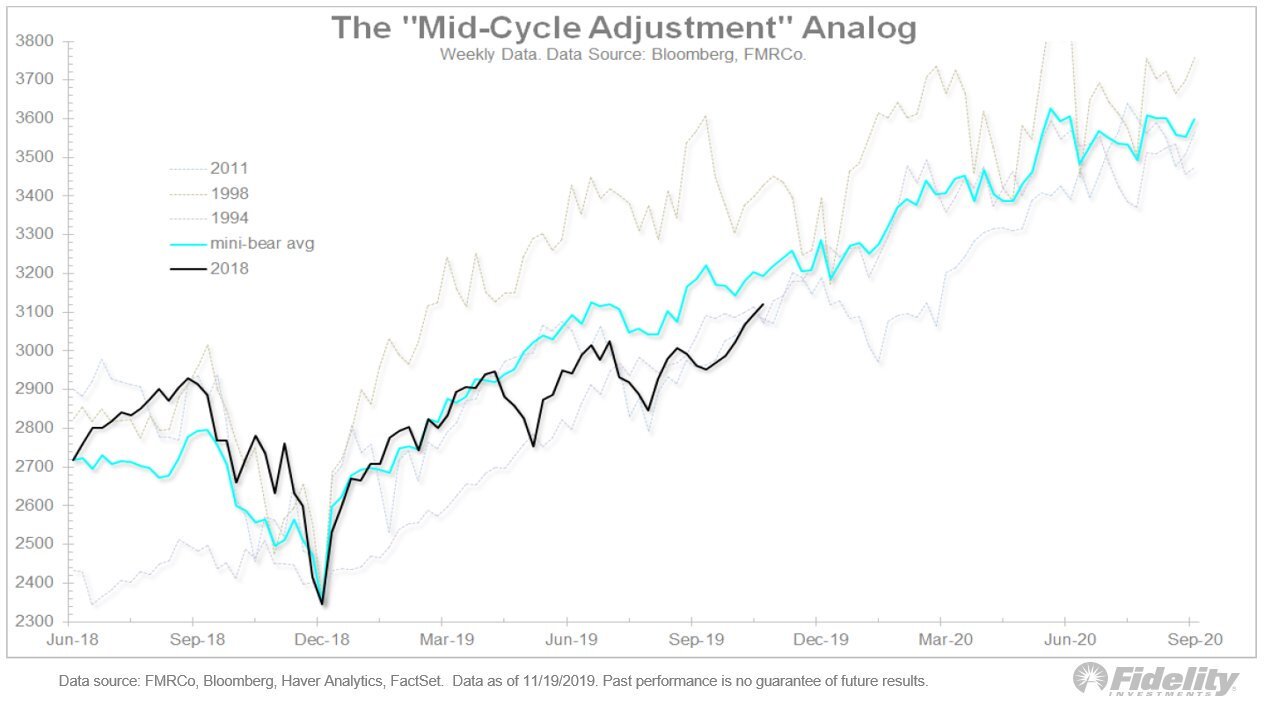
The recent analog chart put together by Fidelity and Factset is interesting. As you can see below, they plotted 27 months of stock market performance data, normalized it from 4 different time periods, ’94, ’96, ’11 and current (black). What falls out is an analog. A tight correlation between price action from the bottom of each cyclical adjustment bottom. With the black line being where we are today, it implies investors should expect smooth sailing for stocks through September of next year. Why September? I have no clue on what or why the stopped the data from there. My guess is the analog fell apart as the data diverged and no longer held.


