I’m much further on the FIRE journey than these good folks being in the triathlon bike phase having now been FIRE’d for a little over a year and having been on my FIRE journey for around twelve years. At one end this means I have more experience and data than these folks but it also means I’m more grey, grizzled and cynical. With that warning out of the way to me that real 7% return assumption just seems way to bullish! So I then asked myself why are they using such high returns in their model as not for a second do I think they are trying to deceive? The simple answer I came up with is that the vast majority of FIRE blogs are from people who are pre-FIRE with many never having witnessed a bear market so they have no real life data, only published financial data. Then from those that are FIRE’d I am yet to see transparent long term portfolio returns shared. So today’s post aims to do just that. Put a stake into the ground where hopefully your comments and other bloggers posts will tear my investing performance apart showing me to be either a poor, average or good investor. With time that might help us all fine tune the expected returns we can all plug into our much loved spreadsheets.
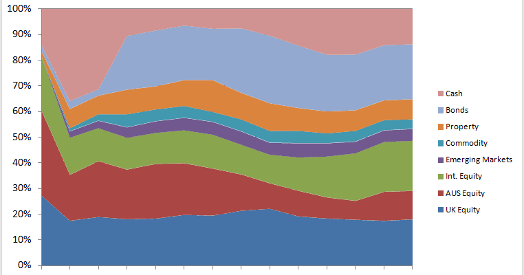
My portfolio performance is an annualised number covering my investment performance from the end of 2007 until the present day. This means the portfolio saw the vast majority of the Global Financial Crisis bear market and the bull market since. The portfolio has also seen annual investment expenses which started high and now run at 0.21%, trading costs, withholding taxes, rebalancing including buy/sell spreads, new purchases and a lot of learning (also called mistakes). It’s largely based around Modern Portfolio Theory where I started with the methodology described by Tim Hale in Smarter Investing. It’s included my initial don’t know what I’m doing phase, my I have a strategy and am repositioning myself phase, my tinkering around the edges phase, gradual repositioning (heavier weighting to the likely retirement region/country) to suit the desired retirement location as well as building/maintaining low risk cash/NS&I reserves to support an eventual retirement home purchase. If I chart all of that the portfolio has changed like this over the years:

Click to enlarge, RIT Asset Allocation by Year
If you squint at that chart it looks not unlike a 60% Equities : 40% Bonds asset allocation for the vast majority of the journey.
So then the million dollar question, actually it’s the million pound question as I’m a UK based investor, is what’s my real life portfolio return actually been? Drum roll please… The answer is a nominal portfolio return of 6.4%. During that period inflation has been 2.7%, as measured by the RPI, leaving me with a real portfolio return of 3.7%. That is a long long way from 7%!
So the next question becomes am I an average, poor or good investor? Over to you…