
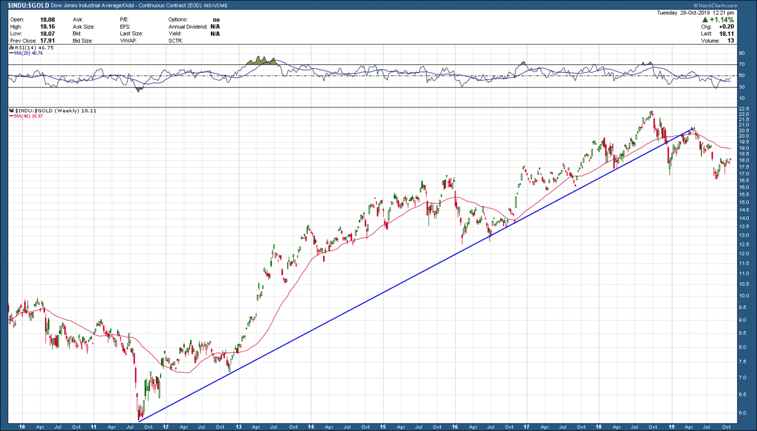
Even going back millennia, it has been shown trends persist when it comes to investing. The reason why is because there is one thing that has been constant throughout, humans and human behavior. While the vehicles in which to invest changed as have the markets themselves, human behavior perseveres. One of the most recent examples has been investors 8-year preference of investing in US stocks over gold. During that period, US stocks (using the Dow Jones Industrial index as a proxy) have outperformed gold by > 275%. In hindsight, it made no sense to be “diversified” in gold as it was nothing more than an anchor to your portfolio. Stick with those that are in an uptrend and outperforming. The DJI/gold ratio chart below provides additional data that things just may be a changin’ with respect to under-performance of the shiny metal.
Ratio charts are a useful tool to help identify potential changes in longer term trends in addition to finding relative strength.. The sooner you can identify and confirm a change in direction, the sooner you are on board a rising, profitable trend and why every investor should have this arrow in their quiver.


