Today in The Morning Chai, we look at the Bitcoin Chart, briefly talk about the Inverted Yield Curve and understand that time is money.
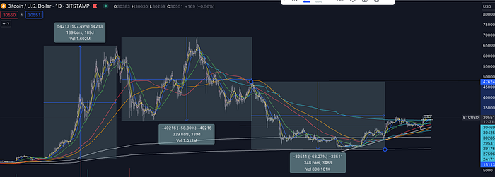
The Bitcoin BTCUSD Chart is poised interestingly. Here in Fig 1, the BTCUSD chart is shown on a daily timeframe over a period of 3 years. The BTC prices are shown along with its moving averages.
If you notice, the most beneficial periods for investors have been when all the moving averages have been trending in the same direction. The Yellow line is the 200DMA (200 Day Moving Average), Red is 150DMA, Green 50DMA, Blue 21DMA, Yellow is 10DMA and pinkish hugging the price is 5DMA.
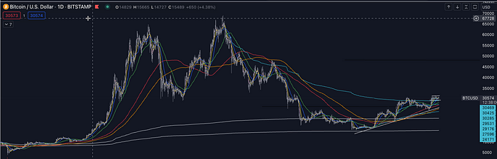

The period from Oct 2020 to mid April 2021 was the best period for investors and traders alike with all moving averages in an uptrend. This uptrend started as Bitcoin crossed its last having in May 2020. This was the time period when BTC returned 500% in 1.5 years.
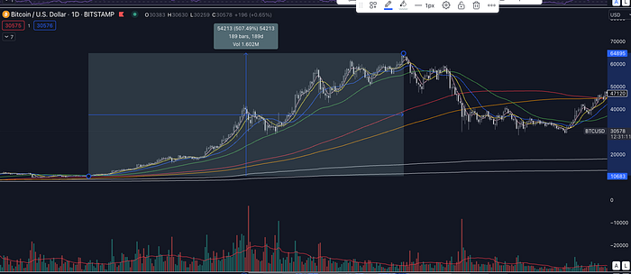

The period from Apr 2021 to Mar 2022 was a period of uncertainty with BTC prices hovering between 28K and 69K with moving averages crossing each other many times as shows in Fig 2 (the 2nd rectangle).
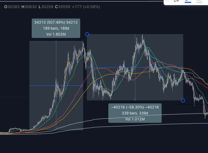

This was followed by a period of bearish drawdown of -68.27% with BTC prices tracing back towards 17,000 USD. Refer Fig 3. This was a clear downtrend with all moving averages trending down.

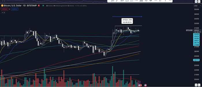
This brings us to the current day, where-in, I believe we are poised interestingly for the future. The blue line is the AVWAP (Anchored Volume Weighted Average Price) from its prior pick. For the 1st time, the BTC price is over the AVWAP from 10 Nov 2021 high and has remained so for more than 3 weeks since 21st June 2023. (Fig 4). Notice how all moving averages are poised to be trending in the same direction and that is higher. It will be important to track the volume in the next few days and months.

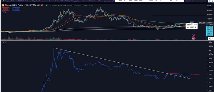
The other thing to note is that the On Balance Volume is broken its long term downtrend and is currently hitting resistance at the red trend line in Fig 5. A break above the trend line could be a positive indicator.

There is talk about the US yield curve being the most inverted since 1980’s. The inverted yield curve means that the interest rate on long term 10 year treasury bond is lower than the interest rate on the short term treasury bonds.
As shown in the tweet below, the US yield curve for 10 year bonds minus the 2 year bonds is currently negative which signals a negative or inverted yield curve. Many investors look at the spread between the 2 year yield versus the 10 year yield as an indicator of the health of the economy. An inverted yield curve in the past for a protracted period have signalled a recession.
Hence, the yield curve is gaining traction in the media and twitter. Whether this signals a recession in the coming days or not, its worth understanding what a yield curve is and what inverted yield curve means.
“Time is the most important possession of your life”. You can lose everything and get it back in some shape or form. But you can’t get back time.
You lose your wealth, you can make it. You lose a loved one, you will find another loved one. You lose power, you can regain it. You name anything in life and you can get it in some other form if you lose it. But not time.
“Value Your Time”
Did you know “Shopify, ticker symbol SHOP has introduced a calculator that calculates how much money is lost in pointless meetings. I think, its a great idea as there are countless pointless meetings, meetings with more than necessary people, or meetings without purpose happening in offices around the world (including quiet a few coffee and lunch/dinner ones).
One tech company is escalating its war on meetings by introducing a calculator that shows employees how much it really…
Most Mornings, I publish “The Morning Chai” right in time for your favourite tea or coffee with 3 short ideas/themes related to Life & Finance — the two ingredients for success. The idea of teaching Finance & Life skills to my kids has been the genesis of “The Morning Chai”.
“Thank You Satvik & Ritika — the love of my life for being my inspiration.” — Santo