
Including semantic elements gives your subscribers who use screen readers the option to “scan” through an email by header. You can do this by using and
Historically, styling and
And this is the paragraph
For semantic elements, use margin, not padding, as the padding attribute isn’t supported on these elements everywhere. As for rems, Josh W. Comeau gives guidance on his blog.
Tip: Using mso-line-height-rule:exactly; in your
Improve the readability of your email
Creating a more accessible and readable email isn’t only down to how the email is coded, but how the copy is written, too. Writing for accessibility involves making your email copy more human, which aids in readability and helps build a 1:1 communication between you and your subscribers.
The most popular test, known as Flesch-Kincaid Reading Ease test, can be found in Microsoft Word and calculates how easy your content is to read on a scale of 0-100. That means:
- A score of 90-100 will be easily understood by an 11-year-old student
- A score of 60-70 will be easily understood by 13- to 15-year-old students
- A score of 30-50 will be understood by college students
- A score of 0-30 will be better understood by university graduates
Making something more “readable” shouldn’t mean you shy away from tricky topics or weighty subjects. Rather than dumbing down your writing, it refers to the accessibility of the text. Opt for smaller words; if you’re not sure if everyone knows what a particular word means, refrain from using it.
For most businesses, your sweet spot is somewhere between 60 and 70 to capture a general audience. Of course, if your audience is highly educated, then don’t be afraid to use more complex language.
Some other points to consider:
- Keeping sentences to around 20 words or less.
- Edit your copy to be direct and to the point.
- Use active voice to keep the sentence structure simpler.
- Avoiding slang, jargon, or regional words that some people might be unfamiliar with.
Make links clickable/tappable
Ensuring the size of your bulletproof buttons are large enough to be used by thumbs and fingers on mobile devices will help with the accessibility of your email too. A bigger button will be beneficial to those who can’t control a mouse with precision.
Banish the “click here” link copy
Avoid using “click here” as copy for your links. Screen reader users often tab through content, skipping through it as a way of scanning an email. Giving your links context will help these users to decide if they want to click through or not.
For example, if you have a link that goes to a product listing of shoes, using link copy such as “See more shoes” lessens the ambiguity of the link for screen reader users. Reducing the ambiguity of links is beneficial for email accessibility, but really benefits all subscribers. It doesn’t require them to read the context surrounding the link, which helps for those who scan emails.
Banishing “click here” links will also move your email content to be more device-independent. “Click here” may make sense for a subscriber using a laptop or desktop, but not for someone using a mobile device or tablet where tapping is required.
Use the ALT attribute correctly
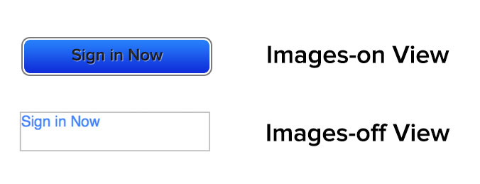
The ALT attribute—used to display ALT text—has been an email best practice since the dawn of HTML emails, owing to email clients blocking images by default. The text used in an ALT attribute attached to an image displays when the image doesn’t load. This helps the subscriber “see” the email if they have images off by default in their email client or if they are using a screen reader to read the email.
To correctly use the ALT attribute, the context of the image must be fully understood in relation to the content surrounding it. First, you need to decide if the image is functional, illustrative, or decorative.
All images require ALT attributes, so a null ALT attribute should be used for images that don’t need to be read by screen readers or don’t represent anything vital to the subscriber.