
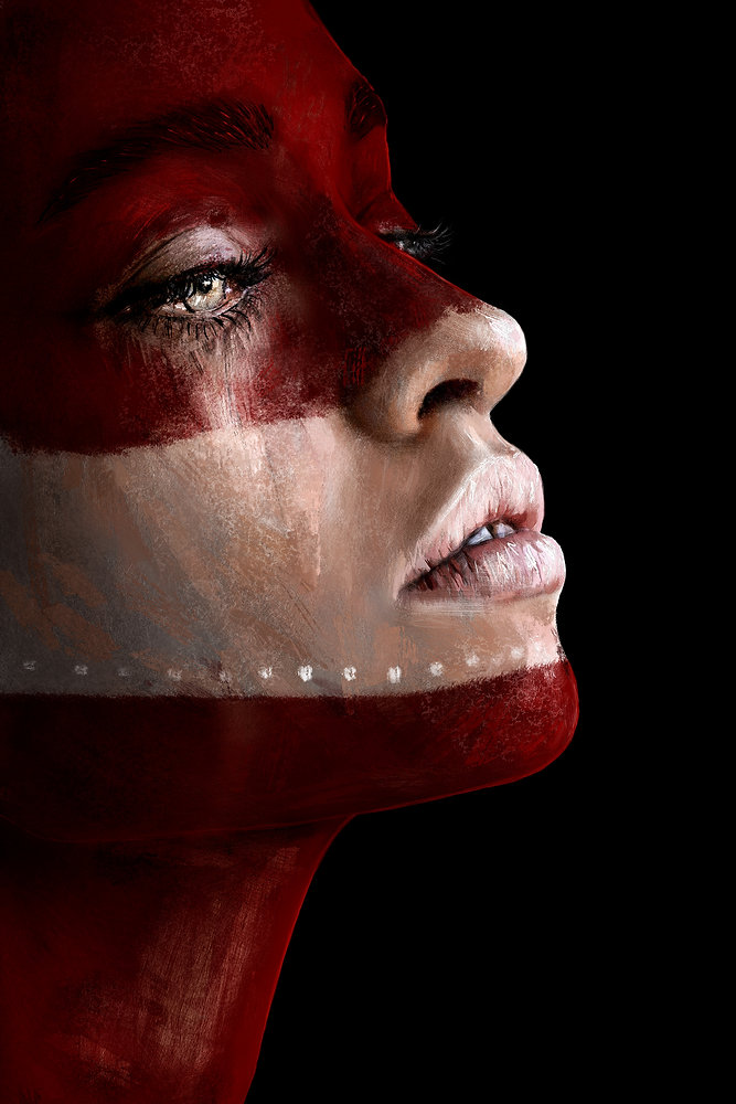

This one actually turned out a lot better than I was expecting. I wasn’t even intending for such vibrant and bold colors, but really like how it turned out. I think I’ll probably do more like this.
Originally I had a ton of extra symbols, face paints, etc on top of the red war paint, but after receiving some really great advice I took it all off. Looks so much better this way.

For some reason this is the song I had in the back of my mind for this one:


