
I promised another post about the art I liked in the Annual Exhibition 2025 of the Royal Society of British Artists.
This is probably the most electic of all the art societies belonging to the Federation of British Artists BA Exhibitions – whose home is at the Mall Galleries.
This is because their media spans drawings and paintings in every media, all manner of fine art hand pulled prints, and sculpture in various media.
As a result, if frequently gets large and imposing works which are absolutely impossible to ignore.
 |
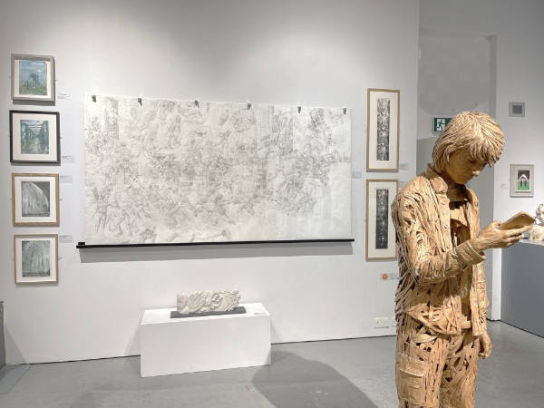
| “Capital at Risk: Drawing the City of London (pen and ink, 1.5m x 2.5m) by Louis Pohl and “Effects of Lockdown” (cardboard, 170x45x45cm) by James Lake |
Two such this year that I found absolutely unmissable in the East Gallery (above) were:
- Louis Pohl‘s very large and incredibly impressive pen and ink drawing of “Capital at Risk: Drawing the City of London (1.5m x 2.5m)
- James Lake‘s Cardboard sculpture of “Effects of Lockdown” (170x45x45cm)
I work with cardboard for its immediacy, ease of availability and low environmental impact. My disability and dyslexia have also influenced my choice of material and the way I create my sculptures. For over twenty years I have created life-size three-dimensional portraits of people.
There is just so much to look at in Louis’s drawing – in terms of both realism and allegory and just sheer expertise in the use of pen and ink for drawing people! I was extremely surprised that it did not get a prize for the ambition and the story-telling. As in “truly gobsmacked“!
By way of contrast, James Lake’s sculpture won The Nathan David Award for Sculpture.
I also spotted a style I recognised straight away in the East Gallery – although I’ve not seen it in some time. It’s very memorable.
 |
| “The Sky” by Ana Schmidt Acrylic 73x 65cm |
“The Sky” by figurative artist Ana Schmidt reminded me a lot of the much larger painting she created which won the £20000 Columbia Threadneedle Award 2018 for contemporary figurative and representational art. She is amazing at painting urban landscapes with huge sheets of water or puddles which reflect the sky.
 |
| Fishing Boat – Essaouira by Richard P Cook 45 x 60cm oil |
I think I like his work because he paints in oils rather like he paints in watercolours. Which is a great way of getting a very identifiable look. However, it’s worth noting that Richard P Cook has been a member of the RBA for 40 years – and when I went to look at his website I knew his work right away.
 |
| Anna Rotheisen with her paining”Ally Pally” and its buyer – a man who knows a good painting when he sees one! |
Interestingly, I liked it so much I went back and made a note of her name and decided to go look for her – and ran into her straight away. She kindly agreed to have her photo taken with her painting – and we had just finished when an arm leaned in from the right and fastened a red spot to the caption on the wall for her painting. “You’ve sold!” I said. Anna’s mouth dropped while I moved in on the purchaser and asked if I could have a pic of him with the artist who had painted his new painting. It turned out that he had no idea where it was – he just really liked the architecture.
 |
| Three soapstone sculptures of birds by Carolyn Simpson |
I also liked the etchings produced by Martin Langford RBA. Ride of your Life is one of them. Martin is an award winning artist printmaker creating artwork on social commentary, the environment, politics, human nature and the work ethic.
 |
| Ride of your Life by Martin Langford RBA |
 |
| “Only way is up” and “Big Ben” by Nathalie Pymm hand pulled lino reduction prints |
On the end “feature” wall of the West Gallery was a painting I instantly recognised as being ny Melissa Scott Miller – but was also one of the most colourful ones I’ve seen in some time. Like Ana Scher, the urban landscape is what she specialises in. You can spend ages letting your eyes wander around one one of Melissa’s paintings.
 |
| Painting together in an Autumn Back Garden by Melissa Scott Miller oil on canvas 92 x 72cm |
The Catalogue must be readable
One thing I did notice is that the huge increase in artworks included in the exhibition has meant that the font size used for all the artworks listed in the catalogue is such that it makes it incredibly hard to read the catalogue.
Less artworks and the catalogue back to normal next year please!


