

Responses by Knom.
Background: At Mugaritz, the boundaries between the culinary and the philosophical blur. The main challenge for Knom was to translate this physical experience, avant-garde philosophy and the restaurant’s history into the digital realm, avoiding a standard design that would diminish its contemporary character. Additionally, the goal was to align the digital experience with the physical one, mentally preparing future diners long before they step through the restaurant’s door.
Larger picture: The site’s launch took advantage of the release of the documentary Mugaritz. Sin pan ni postre (‘Mugaritz. Without bread or dessert’ in English.)
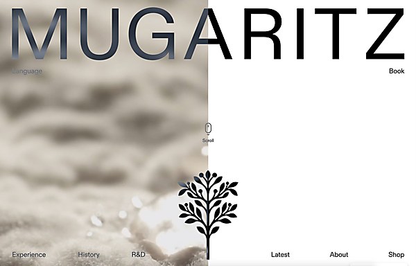
Design core: On one hand, the double navigation, what we call the “boundary,” which not only gives the site a unique look but also offers a very different way of navigating. On the other hand, the art direction: highlighting the typography, the presentation of dishes as objects that “float” throughout the scroll and the radical use of color.
Favorite details: Solving the navigation from a UX perspective. It was a complex challenge, and we’ve managed to make it intuitive and fun. Also, giving substance and meaning to all the materials provided by Mugaritz, thanks to the art direction.
Challenges: Translating the concept of “boundary,” which is at the core of Mugaritz’s DNA and was clearly meant for us to be the backbone of the site, into a design that not only represented the boundary but also allowed users to “cross the boundary” by navigating between two layers, breaking all standard web usability conventions. Additionally, it had to be easy to navigate, visually appealing and understandable.
New lessons: At first, we thought onboarding would be necessary, with a guide to explain the site and prepare users for navigation. However, all the tests we conducted showed us that this approach was completely off. The organic, natural exploration of the site, along with subtle tooltips, proved to be much more fluid than providing explanations. People enjoyed discovering it on their own much more.
Navigation structure: The design is centered around the concept of “boundary” and the dualities that Mugaritz embodies, such as freedom/restraint and chaos/method. We took this concept to the extreme by creating a double navigation that reveals some things and hides others. Just like the dining experience at Mugaritz itself, it’s a game; each user will have a different experience when interacting with the site.
Special navigational features: The ability to open and close both halves of the page with a single click, which lets the user move quickly and intuitively between the two sides of the “boundary.”
Technology: The website was developed using WordPress as a CMS, with deep customization and theme development from scratch using modern web technologies—mainly CSS and vanilla Javascript. The whole site is modularized, including future pages, and can fully be edited by the client using a visual interface.
Browse Projects
Click on an image to view more from each project


