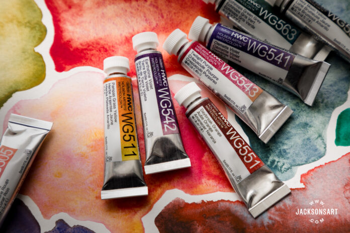
The new Holbein Artists’ Granulating Watercolours are an exciting addition to Holbein’s continually expanding line. I tested all 24 colours, and picked out some of my favourites that I believe would make a great addition to a watercolour set.
When I first heard that Holbein was producing granulating watercolours, my interest definitely piqued! I am a fan of Holbein’s premixed colours – I use their Acryla Gouache, Irodori Gouache, and pencils regularly across my mixed media practice. Here, I will be looking at the properties of the new Holbein Artists’ Granulating Watercolour paints, how they perform, and how I might choose to use them.
I had the opportunity to test the Holbein Artists’ Granulating Watercolour set of 24 x 5 ml, and was inspired by its beautifully varied and exciting colour palette. Some of these colours may even surpass my previous favourites from Schmincke.
Consistency and Performance of the Holbein Artists’ Granulating Watercolours
The Holbein Artists’ Granulating Watercolours perform consistently well across every colour. There was little to no separation between the binder and pigments in the box that I tried, meaning that the ‘goop’ that you can sometimes get when you open a fresh tube of watercolour wasn’t present. Some of the colours felt more transparent than others, but my findings were in line with what was claimed on the colour chart. The high pigment density in some of the paints I mention below creates a beautiful variation in depth when painting.
I found all the paints to be smooth and easy to work with across both Jackson’s Bockingford Watercolour Pad 300 gsm Hot Press Smooth and Jackson’s Bockingford Watercolour Pad 300 gsm Rough. They rewetted easily after a couple of days on the palette, and lifted well off the page with water once dried, as you can see from the swatches. I left them for approximately 24 hours. Holbein rates all of the paints as ‘permanent’ or ‘absolutely permanent’ on their lightfastness scales, which I was pleased to see considering some of the bright pigments. Some of the colours had a slight staining but it is subtle and to be expected.

The Colour Range
There’s something for everyone in this range, and I was pleasantly surprised to see several red/pink-based colours when opening the box. In my personal experience, there seem to be fewer highly granulating colours on the market in this bracket, so I had high hopes. The darker colours look lovely, but having several granulating darks in my existing collection I was looking for something exciting, and I’m happy to report I found that. There were some greens and blues that interested me, with one of them being an alternative to another popular granulating watercolour from Daniel Smith. For this article, I have chosen to look at the colours that most intrigued me.
Eurasian Jay Rose Grey
This particular paint seemed to be getting quite a lot of attention online, and I initially thought that this might be comparable to Daniel Smith’s Moonglow, a very well-loved paint.
The pigments in Eurasian Jay Rose Grey are Ultramarine Blue (PB29), Viridian (PG18), and Pyrrole Orange (PO73). The differing pigment in Moonglow is Anthraquinone Red (PR177). And if I’m honest, I was surprised by the huge difference that this pigment swap had on the overall warmth of the paint. Of course, this doesn’t take into account the balance of pigments, but Eurasian Jay Rose Grey had a beautiful and unexpected warmth to it, the Pyrrole Orange being the perfect antidote to the Ultramarine. In large swatches with a lot of water, the orange leaves the impression of a soft peach. As far as granulating paints go, this one is incredibly satisfying, and I can see myself using this colour a lot to bring a little bit of ‘something’ to an otherwise dark area or shadow.
Peafowl Green
This is another paint that looked, in swatches, to have similarities to another favourite of mine – Daniel Smith’s Cascade Green. Unlike the previous paint, the pigment makeup is more obviously different, yet the results are far more comparable. Peafowl Green is to my eye brighter, with a slightly softer granulation, but due to there being four pigments, this gives it a subtler but still exciting effect. This would make a lovely addition to an en plein air palette for the spring and summer.
Daybreak Orange
Daybreak Orange is a firm favourite for me. On the first application, it’s a strong, opaque dark orange, but the moment you add water you can see the addition of the Cobalt Green (PG50) pigment bringing the Pyrrole Red (PR254) and Orange (PO74) to life. It shifts beautifully, leaving the impression of a blue-pink that contrasts with that dark orange. It was unexpected, but I have already enjoyed using this for autumnal foliage and to give depth to a limited palette. I can imagine it adding warmth to any dark scene, or a touch of brightness to an otherwise muted painting. The name is perfect – it’s that first flash of the sun after a long cold night.

Twilight Purple
On first impression, Twilight Purple felt like more of a lilac leaning pink to me with some warm granulation. It’s composed of Cobalt Lithium Violet Phosphate (PV47), Potters Pink (PR233), and Orange (PO13). Potters Pink is a very popular pigment with watercolourists due to its highly granulating nature. The addition of it in this paint brings out the qualities of the Violet and Orange, whilst lending a softness to the overall effect. Another aptly named paint, a colour for warm evening light.
Rainy-Night Moon Black
The mix of Ultramarine Blue (PB29) and Synthetic Iron Oxide Red (PR101) makes a deep opaque black, appearing like a Mars Black when densely applied. But again, this washes out to a lovely warm shadow colour. It is a versatile colour that when used alone reminds me of the calm after a storm as the rain stops. The name, Rainy-Night Moon Black, describes the colour perfectly.

Flamingo Orange
Flamingo Orange has a luminosity to it that I didn’t expect, especially from the combination of just two pigments, one of which is Potters Pink (PR233). The Pyrrole Orange (PO73) strength of colour lifts the whole paint, and whilst the granulation itself is lovely, it’s the colour that puts this on my favourites list. Another perfectly named paint.
Mimosa Yellow
Mimosa Yellow is a more transparent paint than my previous choices, but I thought it deserved a mention. It is made of Praseodymium Yellow (PY159) Ultramarine Blue (PB29) and Chromium Oxide Green (PG17), and creates a gentle green reminiscent of quiet growth in early spring. You can see the individual pigments coming through as you add water, but I would describe this as having more of a lemon or green undertone than yellow. This would work well in botanical painting.
Mixing Colours with the Holbein Artists’ Granulating Watercolours
I don’t often use granulating colours for mixing. Do you know the phrase too many cooks spoil the broth? In this case, I believe that too many pigments spoil the whole point of granulating paint. I like to see the individual pigments in these paints. There’s something magic about the chemistry of it all – not being able to fully control how the pigments separate is quite a liberating practice.
It’s not always the case, but I find that mixing two granulating paints simply dilutes this effect. The pigments blend together, as they’re designed to, but you lose that magic. Nevertheless, I spent some time playing with mixing one granulating colour with another, to see if there were any interesting effects.

In my opinion, Cherry Blossom Pink and Pampas Grass Yellow both have a more subtle granulation than the rest of the set due to the lack of contrasting pigments. So when mixing these colours with some of the more highly contrasting colours the stronger individual pigments were still visible. Daybreak Orange and Lunar Eclipse Red made for a vibrant, deep and unusual colour, where the granulation and pigments were clearly visible. Ocean Blue added to Moonlit Night Blue and Shoebill Blue Grey made for some wonderfully deep teals too.
However, I will stand by my words with this one, in that I don’t think they need to be mixed. The Holbein Artists’ Granulating Watercolours have clearly been created with a lot of attention to detail and consideration, and offer an exciting alternative to standard paints, or a new addition for any granulating watercolour enthusiast.
Further Reading
Holbein Irodori Gouache Seasonal Palette Reviews
Green Gold and its Colour Mixing Possibilities
Painting with Schmincke Supergranulation Watercolours
Inside the Sketchbook of Frances Ives
Shop Holbein Artists’ Granulating Watercolour Paint on jacksonsart.com


