
When I originally set out to design the Hellcat I had the burgundy dial in mind. The first Sylph had just been a major hit and I thought the Hellcat in burgundy would be, in many ways, its successor. I was a bit surprised when the people who liked the Sylph liked it for more reasons than just the burgundy – not many of the Sylph fans were Hellcat fans. I had created a new watch with an entirely new look and feel, and as a result, a (mostly) entirely new demographic of people would like it. It was, after all, quite different in nearly every way from the Orion 1 case platform and the Sylph dial.
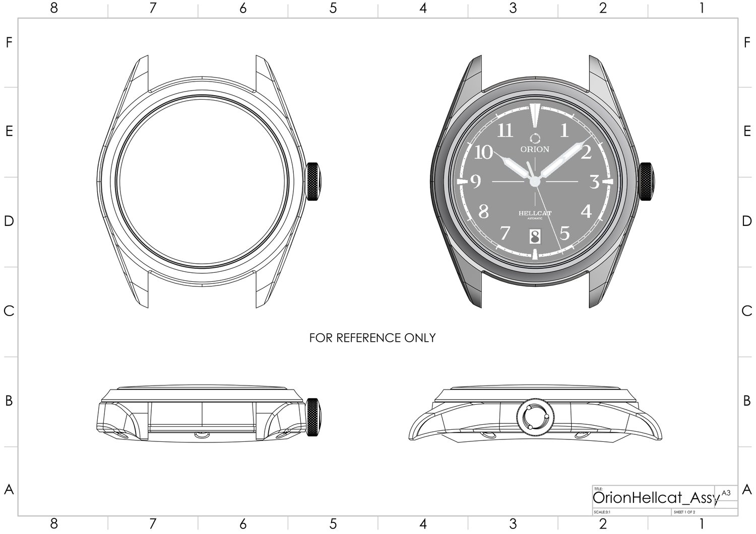
As noted, I wanted this watch to feel like an Orion, in the case that was through using similar lines as the Calamity, similar features, that could easily be called back to Orion design. I also wanted something unique to Orion. Something that would give it undeniable identity. The Orion Classic typeface was designed. An entire alphabet, letters and numbers, created for the Hellcat and subsequent watches and revisions. Crisp serifs, used by the pad printers of the past to increase crispness and the cleanliness of the ink when the pad was lifted from the dial, became a classic “watch” typeface styling. Open numerals, pointed tails, a familiar clarity, and sharp legibility were the driving design forces in the Orion typeface. Unique enough that it should feel novel and refreshing, but again, not so different that it feels outlandish or misplaced. The details of the Hellcat were all intended to be subtle and not overt, a treat for the discerning customer who takes time to notice.
Many of the watches that interested me before starting Orion were vintage watches, largely because they were what met my criteria for wearability and comfort, not to mention the exciting designs. Syringe hands, which are perhaps an evolution of cathedral style hands (which I love), were the choice for the Hellcat. The goal here was to remedy what I felt was the agitation I felt with many (not all) brands execution of syringe hands. Which is that they all felt disproportionate. Other brands often had hands that were seemingly bloated, or perhaps the minute and hour hand were too close in size, or too similar that differentiation of hour and minute at a glance suffered, the list could go on. I wanted the syringe hands to be proportional, but I also wanted to make them easily discernable from each other at a glance – a well designed watch should be highly legible very quickly, a design that forces the wearer to labor over discerning the time is either poorly designed or a concept piece. I wanted to do these things while bringing an elegance to them, soft angles but defined well. The minute hand has an arch in it, which took some work to finally be able to have it a sharp chevron and not muddy looking. The blade of the seconds hand is also much thinner than the industry standard, while some people complain of legibility of the seconds, I do feel it falls in line nicely with the needle section of the hour & minute hands as well as the overall look of the watch.
The dial, even with things like Orion Classic and balanced hands still looked off. Early Hellcat renditions struggled with looking too generic, to combat that a lot of work went into finding the best design for the minute track. Looking back, I recall seeing a good deal of the watch already completed in my mind’s eye but the minute track took many, many iterations to bring the watch together. Below is a gallery of the Hellcat (before it was named the Hellcat) with a basic minute track and some of the crown iterations/studies it went through. It probably had more than a dozen crown versions. Now, you may know why I’m short with people when they ask, “Have you thought of…..” because most likely, I have I thought of it. You can see how with the more Calamity-esque dial that it wasn’t quite as lively or “right” feeling as the Hellcat we eventually landed on.


