
10 Jun No Fear in Decorating
We recently saw a reel on House Beautiful’s Instagram that got us thinking about the emotion of fear, and how it relates to interior design. This is not a new topic of conversation for us. A while back we wrote about the psychology of color in interior design on our blog. Color was a major theme in the post, and we identified some of the emotions that different tones can evoke. While the commentary in the Instagram video spoke more to avoiding beige as a mindset, and not the actual color, it made us think about some of d2e’s past projects, and how the relationship between neutral and color is an ever-present topic of conversation in the design process. Deciding how much of one vs the other is a formula that an interior designer can help you calculate. We’ll walk you through some examples in our portfolio, which easily illustrate this point.
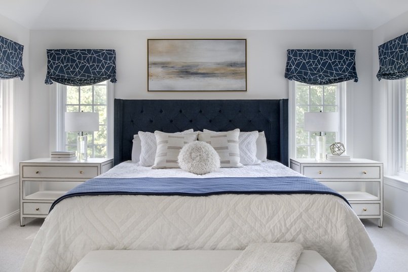
In the bedroom of this Merion Station home, there is an undeniable feeling of serenity. The airy walls and neutral bedding make this a calm place to rest at the end of a long day, but do not think that personality has been sacrificed. The pop of green in the nightstands proves that just a touch of color can make a big impact. These bedside tables were a Facebook marketplace find, and with a bit of paint, they now have a completely unique set of nightstands. We love a repurposed piece because it’s the most sustainable option, made more special with a custom touch.

Photo by Rebecca McAlpin
In the Wynnewood living room below, there are major neutral elements, such as the grey walls and white slipcovered furniture. Even the window treatments are neutral. Despite this, the addition of a hot pink rug, and complimentary pillows on the sofa make the room pop! It is a triumphant combination of colors, and should the homeowner ever decide that pink isn’t her mood, the rug can be easily swapped out for a different color and/or pattern.

Photo by Rebecca McAlpin
The family room of d2e’s design consultant Jillian Moskovitz is all about fresh walls, comfort, and yes, color! While she kept the anchor of the room (the sectional), a subtle shade of grey, and the walls and built-in cabinetry white, the use of brightly colored accents are key. Pillows and art make the room come alive. The investment pieces in the space are kept neutral to stand the test of time, but easily changeable accents make this gathering space truly special.

Photo by Rebecca McAlpin
This Bryn Mawr living room is wide open and connected to the foyer and the dining room. As such, a neutral, calm vibe was desired so the spaces could seamlessly flow into one another, but that doesn’t mean there aren’t some bolder touches that break up the beige. Ice blue accents in the art were repeated through pillows and colors in the rug. And all of these soft colors are designed to offset the shiny black grand piano, which is truly the gem of the room.

Photo by Rebecca McAlpin
A sleek city condo might not be the place you’d envision a pink door, but that’s exactly why it worked so well in this client’s bedroom. It’s the unexpected that makes a space unforgettable. While the room is largely neutral, this feature–along with a patterned rug with a similar shade of salmon—keeps it lively. Rather than committing to four pink walls, this measured approach is a great way to embrace vivid paint.

Photo credited to Ambit Architecture
To create a sense of flow and openness in this home in Wayne, walls were taken down; light paint on the walls and trim created a breezy aesthetic. To add a bit of interest to the living room, ikat patterned pillows in blue, coupled with a rug in a palette that connected the light and dark in the space. Even though the neutral details cover more of the room, it’s these punches of color and pattern that draw the eye. And yet, they can be easily replaced, should the color scheme evolve.

Photo by Rebecca McAlpin
As you can see, we’ve made a case for both neutral and colorful decorating choices; they are partners in this process. We’re not saying, “no beige”, but rather, “no fear”. We hope this has inspired you to view your home design as an opportunity for experimentation, within reason. Certainly, there is a place for a completely neutral décor, and if that makes your heart sing, go for it—that’s what interior design is all about! There are so many ways we can inject interest into our home’s décor, and color is only one of them. But, if you admire interiors that use color, and you’ve found yourself equally excited and apprehensive about it, don’t worry! There is an approach that won’t leave you feeling either dissatisfied, or regretful. If you want help figuring out how to manage the balance of neutral to color, reach out to us by completing our Client Contact Form. We’d love to hear from you!