

Our Own Journey Through the Gap
We’ve spent years working on the space between data and the decisions it should inform. It’s a stubborn gap.
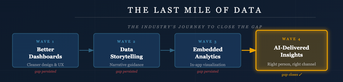
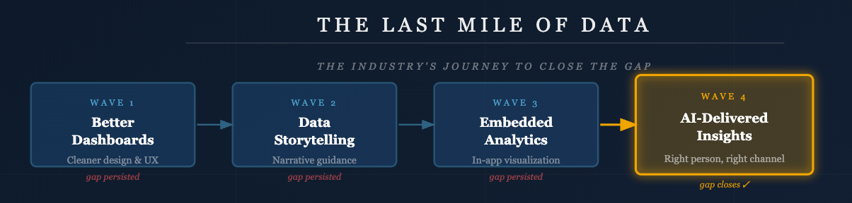
The first wave of effort in our industry was simply building better dashboards with cleaner design, more intuitive interaction, smarter data visualization. We put real craft into this, and it mattered. A well-designed dashboard is meaningfully better. But engagement still lagged. Users who were motivated found them useful; users who weren’t motivated didn’t show up. Better design moved the needle without closing the gap.
Then Juice, and the industry, moved toward data storytelling: dashboards that incorporated narrative flow, contextual guidance, and interpretive text rather than just charts and filters. Instead of presenting data and letting users draw their own conclusions, we gently guided users toward insights. This was a more balanced, streamlined mix of exploration and explanation, and a real step forward. However, we were still asking people to open a tool and engage with it on its own terms.
A parallel and overlapping trend was embedded analytics where we put the visualizations directly inside the applications users already live in. It made sense to visualize the data in the CRM, the learning management system, or the EHR. Stop asking people go somewhere else. This helped close the gap through greater convenience, but as we kept discovering, the applications people use for their work aren’t quite where decisions get made.
Decisions get made in Slack threads and email chains and Teams conversations and across conference tables. Someone shares an insight and a dozen people react to it. If the data isn’t in those conversations, it’s largely absent from the decision. Every step we took brought us closer to the user, the destination was always further than we thought.
What Dashboards Got Right
An argument that often gets lost in critiques of dashboard is that the work of building a dashboard is itself valuable, even if no one logs in.
Designing a dashboard forces an organization to think. You need to decide what actually matters. You have to define the right metrics, agree on how they’re calculated, and make explicit choices about what questions deserve answers and what context those answers need. That synthesis, a process of deciding how a business or a customer should look at their data, is critical work. You are discovering the most important stories to tell.
We might start to think of a dashboard less as a destination and more as a specification: the organization’s best documented thinking about what the data means. That documentation doesn’t become worthless the moment someone decides not to log in. It becomes a meaningful foundation for everything built afterward. A well-constructed dashboard is actually an excellent jumping-off point for narratives and automated insights, precisely because it already contains the framing, the metrics, and the context that make a narrative coherent. Skipping the dashboard phase doesn’t simplify the problem; it just tries to bypass important work.
The critique isn’t that dashboards shouldn’t be built. It’s that delivering a dashboard to an end user and calling the job done turns out to be the wrong stopping point.


