
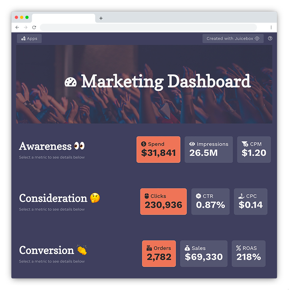

To be effective, a dashboard needs to communicate well. It needs to be clear, concise, engaging, and organized. All that meaning — the metrics, trends, business logic — needs to be conveyed in a way that makes it easily readable for the audience.
That’s where data storytelling comes in. Think of it like this: A bad dashboard is like a collage of data points (like the Spiderman image below), leaving the reader to search for meaning (also like Spiderman, ironically). A good dashboard, in contrast, should be be a guide for understanding — more like a comic strip.


