
Welcome to this week’s publication of the Market’s Compass Developed Markets Country (DMC) ETF Study #602. It highlights the technical changes of the 21 DM Country ETFs that I track on a weekly basis and publish every third week. There are three ETF Studies that include the Market’s Compass US Index and Sector (USIS) ETF Study, the Developed Markets Country (DMC) ETF Study and the Emerging Markets Country (EMC) ETF Study. The three Studies are normally published every three weeks and are sent to my paid Substack subscriber’s email. A total of 71 ETFs are covered in the three Studies. There is also a Weekly publication that is sent to paid subscribers every Sunday titled The Market’s Compass Crypto Sweet Sixteen Study that tracks the technical condition of sixteen of the larger cap Cryptocurrencies.
To understand the methodology used in constructing the objective DM Country ETF Individual Technical Rankings visit the mc’s technical indicators page at www.themarketscompass.com and select “dm country etfs”. What follows is a Cliff Notes version* of the full explanation…
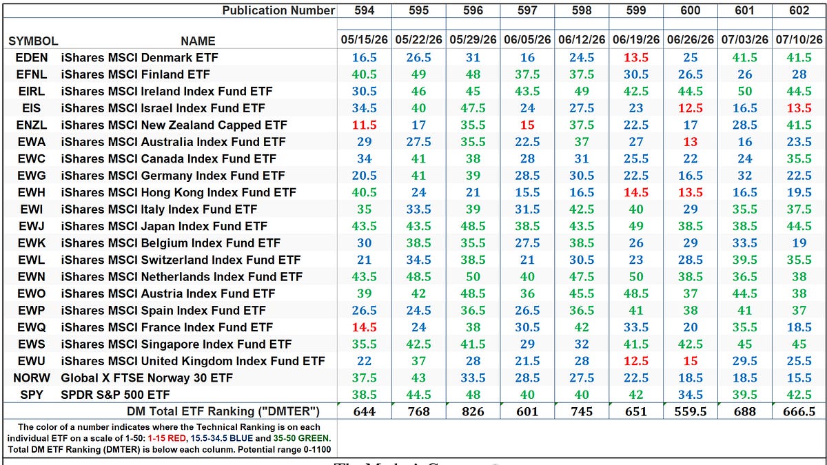
*The technical ranking system is a quantitative approach that utilizes multiple technical considerations that include but are not limited to trend, momentum, measurements of accumulation/distribution and relative strength of each individual DM Country ETF that can range between 0 and 50.
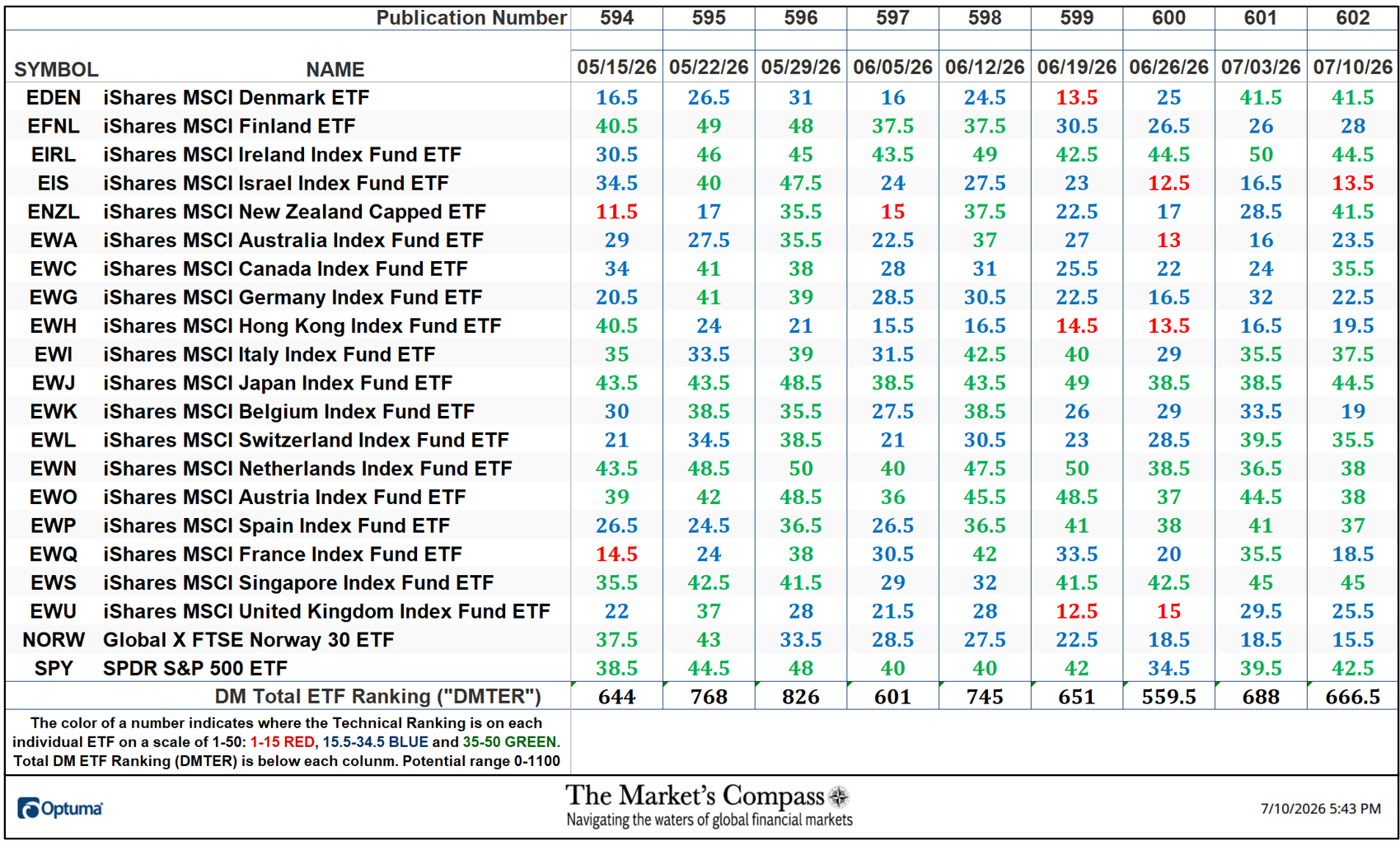
The Total DM Technical Ranking fell -3.13%% to 66.5 from the week before reading of 688 which was a 22.97% jump from 559.5 three weeks ago.
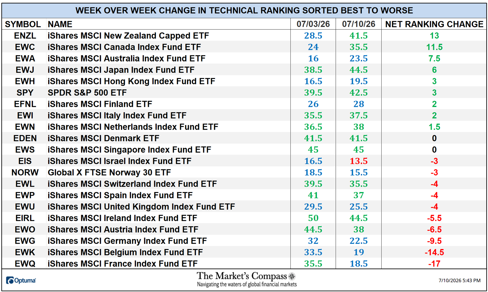
Nine DM ETF TRs gained ground last week, two were unchanged and ten fell. Twelve ended the week in the “green zone” (TRs between 35 and 50), eight ending the week in the “blue zone” (from 15.5 to 34.5) and one was in the “red zone” (from 0 to 15). Two weeks ago, eleven DM ETF TRs were in the “green zone” and ten ending that week in the “blue zone”. The average TR loss last week was -1.02 vs. the previous week’s four- day average TR gain of +6.12 when seventeen TRs moved higher, 2 were unchanged, and 2 fell.
*The 13-Week Simple Moving Average (SMA) lines smooths what can be “choppy” Objective Technical Rankings and better defines the trend in the TRs. Changes in the SMA trends with follow-through are signals worthy of consideration.
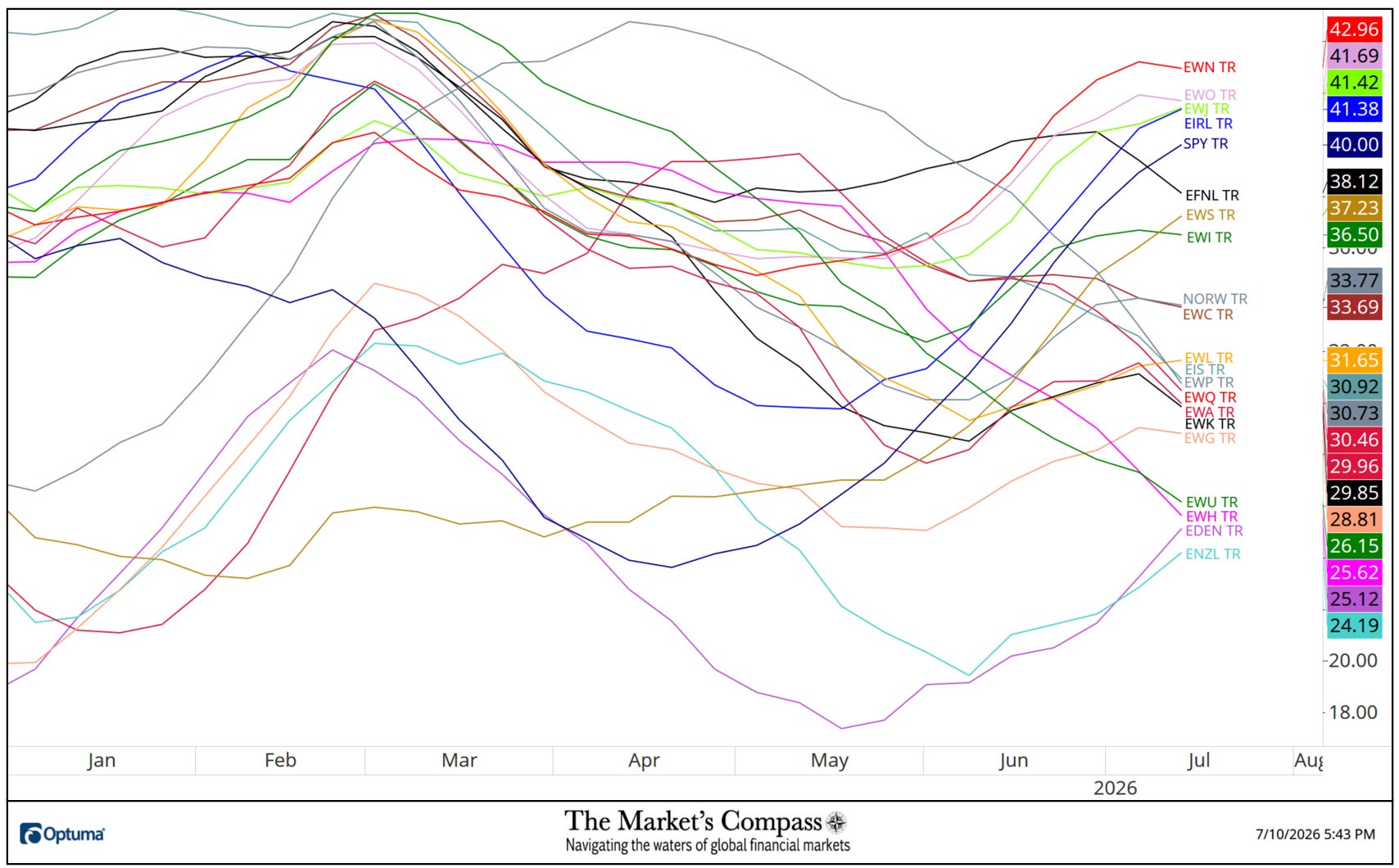
Despite falling back, a “notch”, the iShares MSCI Netherlands Index Fund ETFs (EWN) 13-Week TR SMA remains at the “top of the heap”. The iShares MSCI Spain Index Fund ETFs (EWP) 13-Week TR SMA continues to trend lower since April. and although its declining trend began later in May, the iShares MSCI Hong Kong Index Fund ETFs (EWH) 13-Week TR SMA downtrend persists. The SPDR S&P 500 ETFs (SPY) 13-Week TR SMA and the iShares MSCI Ireland Index Fund ETFs (EIRL)13-Week TR SMA have extended their trends higher.
The Relative Rotation Graph, commonly referred to as RRGs were developed in 2004-2005 by Julius de Kempenaer. These charts are a unique visualization tool for relative strength analysis. Chartists can use RRGs to analyze the relative strength trends of several securities against a common benchmark, (in this case the URTH) and against each other over any given time period (in the case below, daily) over the past three weeks. The power of RRG is its ability to plot relative performance on one graph and show true rotation. All RRGs charts use four quadrants to define the four phases of a relative trend. The Optuma RRG charts uses, from Leading (in green) to Weakening (in yellow) to Lagging (in pink) to Improving (in blue) and back to Leading (in green). True rotations can be seen as securities move from one quadrant to the other over time. This is only a brief explanation of how to interpret RRG charts. To learn more, see the post scripts and links at the end of this Blog.
Not all 21 ETFs are plotted in this RRG Chart. I have done this for clarity purposes. Those which I believe are of higher technical interest remain.
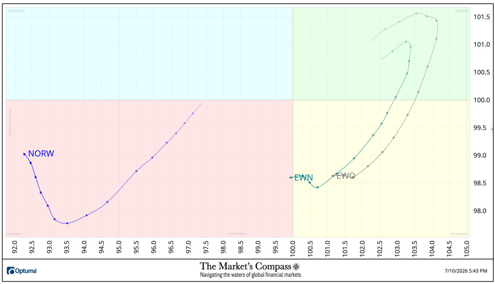
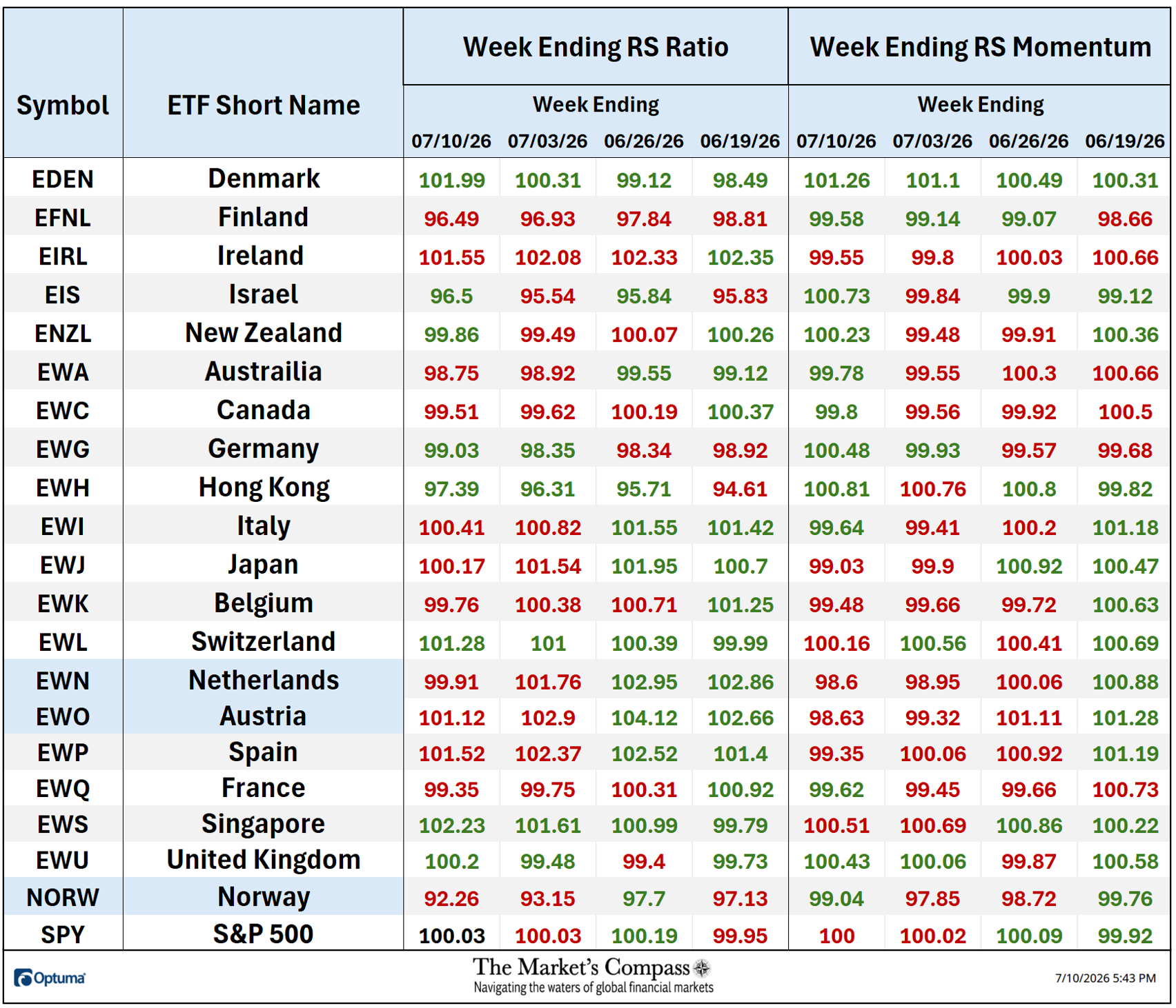
The iShares MSCI Austria Index Fund ETF (EWO) and the iShares Netherlands Index Fund ETF (EWN) both did a U-turn in the Leading Quadrant three weeks ago and fell into the Weakening Quadrant. The EWN edged into the Lagging Quadrant at the end of last week. The Global X FTSE Norway 30 ETF (NORW) had been tracking lower in the Lagging Quadrant, but it hooked higher. Nevertheless, despite improving Relative Strength Momentum it has ended the past two weeks with the worst Relative Strength Ratio of the 21 DM Country ETFs I track in these pages vs. the iShares MSCI World ETF or URTH (see the Tabulation Table below).
The Relative Strength and Relative Strength “Tabulation Table” begins with the readings at the end of last week followed by the trailing three weeks that includes the Readings from the last Study. If there has been an improvement in either the Relative Strength Ratio or the Relative Strength Momentum reading on a week-over-week basis I have highlighted it in green. If there has been a contraction in either, it is highlighted in red and an unchanged reading in either will remain in black. The color-coding system serves as a heat map over the past four Friday’s readings highlighting either the continued improvement, deterioration, or stasis vs. the benchmark, the URTH. The ETFs that are displayed on the RRG chart above have the Symbol and ETF Short Name (Country or Index) highlighted in blue below.
*To understand the construction the of The Technical Condition Factors or TCFs visit the mc’s technical indicators page at www.themarketscompass.com and select “dm country etfs”. For those who unfamililar a shortened version* is explained below…
*The Technical Condition Factors are utilized in the calculation of the Individual DM Country ETF Technical Rankings. What is shown in the excel panel below is the total TCFs of all twenty-one TRs. A few TCFs carry more weight than the others, such as the Weekly Trend Factor and the Weekly Momentum Factor in compiling each individual TR of each of the twenty-one ETFs. Also, the TCFs number of inputs vary. Because of that, the excel sheet below calculates each factor’s weekly reading as a percentage of the possible total which normalizes the inputs. The basic explanation is that the eight TCFs can range between 0% and 100%.
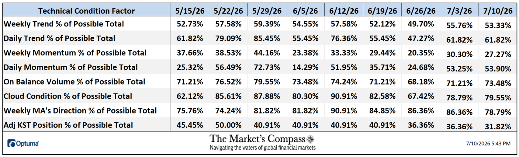
The Daily Momentum Technical Condition Factor (“DMTCF”) rose slightly last week in a row to 53.90% or 83 out of a possible 210 “points” last week from 53.25% or 82 the previous week.
As a confirmation tool, if all eight TCFs improve on a week over week basis, more of the 21 ETFs are improving internally on a technical basis, confirming a broader market move higher (think of an advance/decline calculation). Conversely, if more of the 21 TCFs fall on a week over week basis, more of the ETFs are deteriorating on a technical basis confirming the broader market move lower. On a week-over-week basis three TCFs rose, four TCFs fell, and one was unchanged.
The Weekly Average DM Technical Ranking (“ATR”) in the bottom panel, is the average of the individual Technical Rankings of the 21 Developed Markets Country ETFs I track. It is a confirmation/divergence or overbought/oversold indicator.
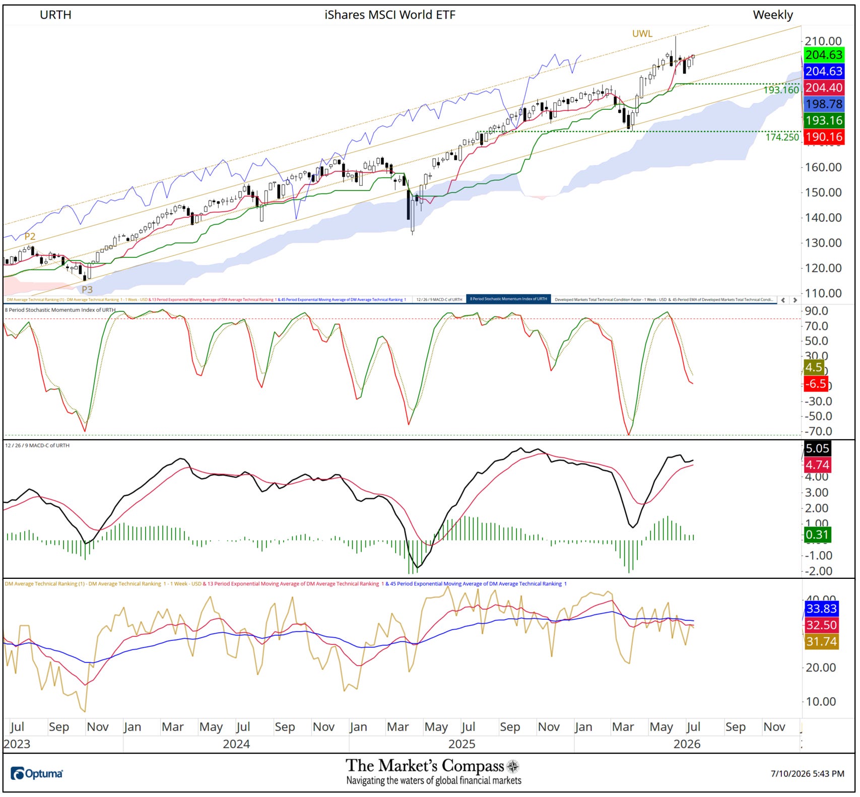
Aside from a Weekly Long Legged Doji Candlestick five weeks ago the URTH has been in a volatile sideways trading pattern for nine weeks by trading above and below the Upper Parallel (solid gold line) of the long-term Standard Pitchfork which I have left on the chart because its validity was substantiated by the Upper Warning Line (gold dashed line marked UWL) capping the aforementioned Long Legged Doji. The 8-Week Stochastic Index has worked off half of its previous overbought condition but continues to track lower below its signal line. MACD rolled over four weeks ago and remains elevated above its signal line. The trend of non-confirmation of higher price by the DM Markets Total Technical condition factor persists with lower highs (yellow dashed line in lower panel) and lower lows with the 9-week SMA (red line) trending lower below the 45-Week EMA (blue line). More comments in Thoughts on the Short-term Technical Condition of the URTH but first…
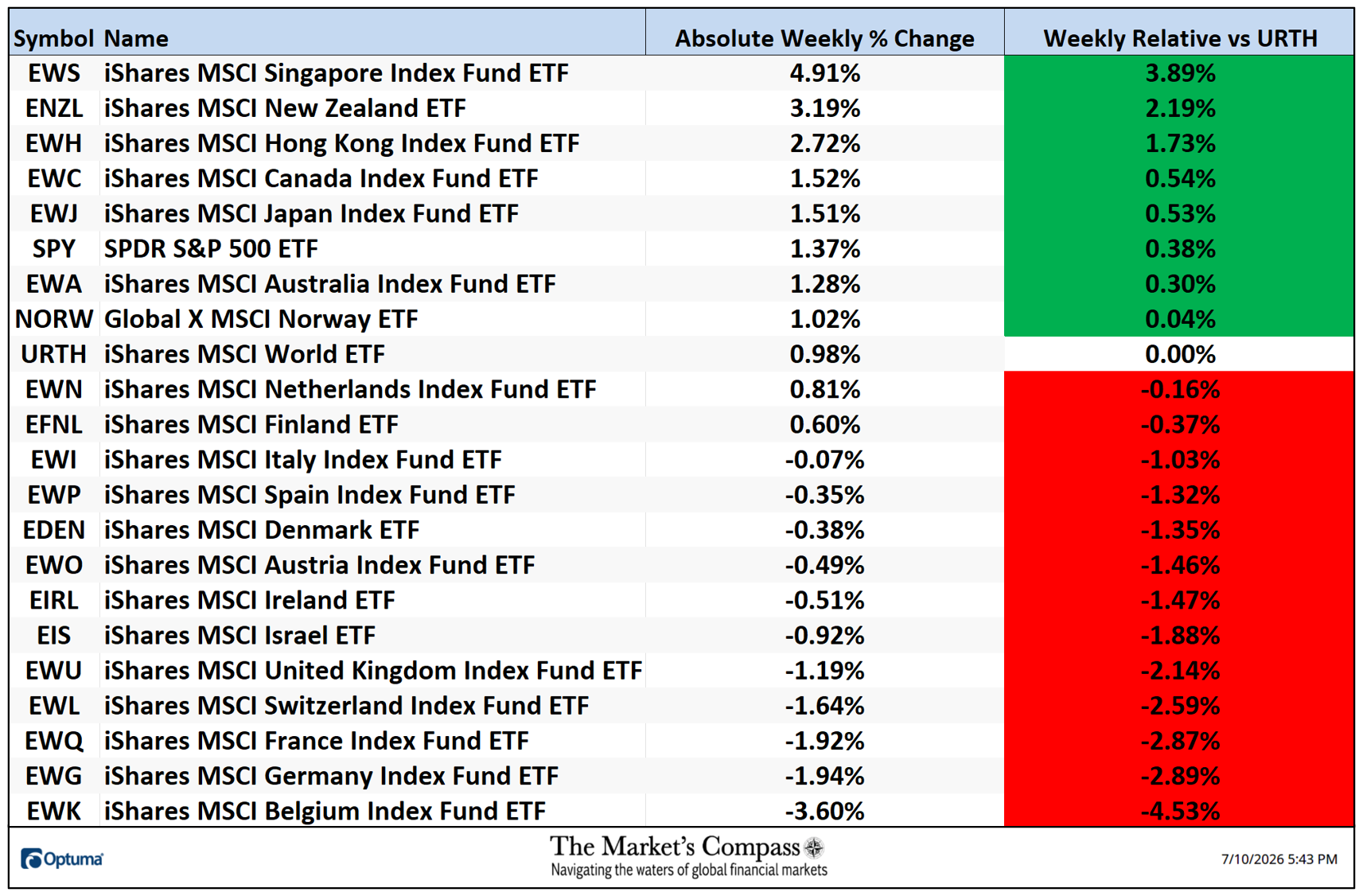
*From Thursday July 2nd due to the Holiday shortened week to Friday July 10th
Ten of the Developed Markets Country ETFs I track in these pages were up on an absolute basis and eleven were down over the week. Eight of the DM ETFs outpaced the +0.98% gain in the iShares MSCI World ETF, or URTH, last week and thirteen underperformed on a relative basis. The five-day average absolute price change was +0.28%, added to the previous week’s average price gain of +1.53%.
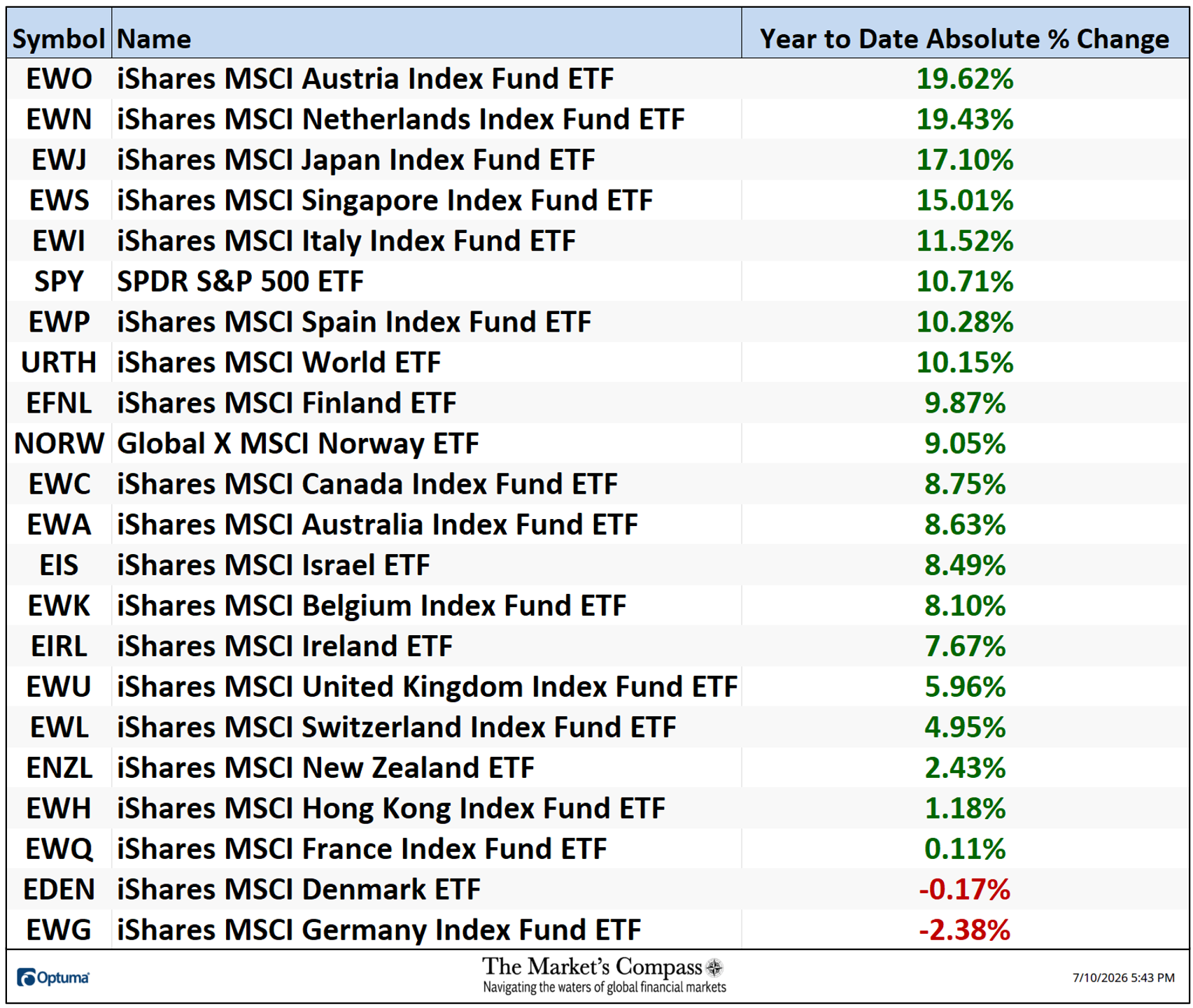
The Average YTD price change of the twenty one DM ETFs was +8.40% last week vs. +8.10% at the end of the previous holiday shortened week.
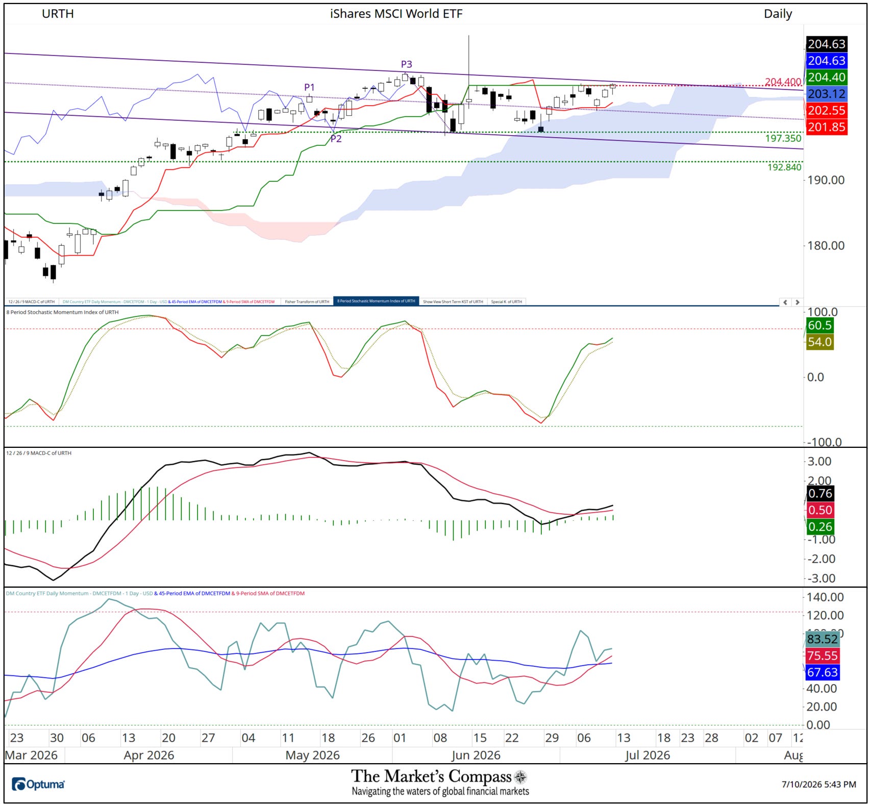
The URTH edged and closed above potential resistance at the Kijun Plot at 204.40 on Friday but still needs to contend with resistance at the Upper Parallel (solid violet line) of the newly drawn Schiff Pitchfork (violet P1 through P3). The 8-day Stochastic Momentum Index has hooked higher avoiding a violation of its signal line and MACD is quietly tracking higher in positive territory. The Daily DM Country ETF Momentum / Breadth Oscillator pulled back to support at its moving averages and remains above both. A follow through rally that overtakes the Upper Parallel of the Schiff Pitchfork (solid violet line) would suggest that the two month sideways Daily price pattern has been consolidation prior to new price highs. Key price support remains at 197.35.
Charts and price data are courtesy of Optuma. Any time series data including my ETF Technical Rankings can be imported, charted, and back tested in Optuma. A three part tutorial on Andrews Pitchfork can be found on The Market’s Compass website.
The following links are an introduction and an in-depth tutorial on RRG Charts…