
William Blake (1757-1827) was a mystic poet and a visual artist who wove his words and images together with a visionary conviction that is impossible to resist. Although today he is internationally revered, in his lifetime he mostly worked in obscurity and in the face of criticism. In an era when weighty oil painting dominated the conventional art world, Blake maintained his dedication to the wonderful translucency and saturation of watercolours and ink – devising a palette that elucidated his inimitable, fantastical realms. This article will explore Blake’s personal life, profession, and experimental breakthroughs, before analysing the palette of four of his radical works.
William Blake’s Life and Practice

Luigi Schiavonetti after Thomas Phillips
Etching, 38.1 × 28.9 cm | 15 x 11.4 in
Yale Center of British Art
For the vast majority of his life, William Blake lived and worked in Georgian London, and the essence of the city seeped into his work. He was the third of seven siblings, born into a working-class family. London’s class inequalities and cast of characters – paired with Blake’s spiritualism – provided thematic inspiration for the moral themes found in his works. He reportedly experienced visions from a very early age. On a famous walk through Peckham Rye in South London, Blake, aged eight or nine, saw ‘a tree filled with angels, bright angelic wings bespangling every bough like stars.’ It was clear from the beginning of his life – his perspective on the world was rare.

Blake’s father was a hosier, and despite his parents working outside the art world, they recognised their young son’s unusual gift for art. Aged 10, his parents enrolled him in ‘Pars’ Drawing School’, led by the artist Henry Pars. Later, at the age of 14, he began his training as an engraver under James Basire, with whom he worked as an apprentice for seven years. This meant that, by as early as age 21, Blake was able to work independently as a trained engraver. His earliest known prints in this line of work were stipple engravings of Jean-Antoine Watteau’s paintings, which display an approach to artmaking Blake would later criticise for its focus on colour and tone, rather than line. He maintained his profession as an engraver for almost all of his creative career, which fed into his opinions on visual art, art history, and the work of his contemporaries, and led him to collaborate with important writers of his era.

James Basire after Benjamin West
Engraving of a painting, 45.7 x 56.5cm | 18 x 22.2 in
Yale Center for British Art
Blake enrolled in the Royal Academy in 1779, although it’s unclear exactly how long he studied there. Only a handful of drawings from the Life Room and plaster casts survive, although it’s recorded that he frequented the library there. In an anecdote recorded by William Blake scholar David Erdman, when the Keeper of the Royal Academy, George Moser, advised Blake to study Le Brun and Rubens to free his hand, in place of the ‘stiff’ and ‘unfinished’ works of the Renaissance Masters, Blake replied, ‘These things that you call finished are not even begun’. From the outset, his stance on artmaking deviated from the popular opinion of his contemporaries. Later, he would shun the Royal Academy and its founder and first president, Sir Joshua Reynolds, referring to him as ‘Sir Sloshua’ to express his distaste in his painting style. He also wrote furious margin notes on Reynolds’ Discourses on Art, including, ‘This Man was Hired to Depress Art’.

William Blake
Pen and ink with wash and graphite, 20.5 x 21.2 cm | 8.1 x 8.3 in
The Metropolitan Museum of Art
In 1780, London experienced violent anti-Catholic demonstrations known as the Gordon Riots, which Blake experienced firsthand. He also lived through news of the American War of Independence, the French Revolution, and the Napoleonic Wars. Working during an era of world-changing conflicts, paired with the religious and social anxieties they generated, solidified Blake’s spiritual solutions as central themes in his work.

Blake considered himself a devout Christian – although he identified with a version of Christianity that the Church didn’t embody, rendering his religious beliefs deeply personal. He asserted that the imagination connected people to God, since it recalled the miracle of Creation and had the power to liberate the world from terrible plights such as greed and war. He also criticised reading the Bible as a doctrine for life or a means of societal control, believing that the rules it laid out restricted human freedom and true spirituality. Notably, he rejected the idea of the immaculate conception, believing it was a means to enforce a puritanical repression of human desire. In his book Jerusalem, Blake summarised his belief in the imagination as an essential conduit for spiritual regeneration:
Notably, he rejected the idea of the Immaculate Conception and Christ’s virgin birth, which he believed was a means of enforcing a puritanical repression of human desire. In his book Jerusalem, Blake summarised his belief in the imagination as an essential conduit for spiritual regeneration:
‘I know of no other Christianity and of no other Gospel than the liberty both of body and mind to exercise the Divine Arts of Imagination – Imagination, the real & eternal World of which this Vegetable Universe is but a faint shadow, & in which we shall live in our Eternal or Imaginative Bodies when these Vegetable Mortal Bodies are no more.’

William Blake
Relief etching with watercolour, pen and ink, and gold on paper, 26.4 x 34.3 cm | 10.4 x 13.5 in
Yale Center for British Art
Staying true to his conviction on the power of imagination, a number of his visionary spiritual artworks contain a wide cast of unique characters, each crafted by Blake to be archetypal embodiments of values, emotions, and psychological states. They have a complex interconnected mythology of their own that is impossible to briefly summarise, with some characters being relatives, reinterpretations of conventional religious figures, or versions of real people. Some of these include Urizen, Blake’s version of a God of the Old Testament who carries instruments to limit the universe. He is placed in direct opposition with Orc – a revolutionary spirit, filled with passion. Enitharmon is Orc’s mother, who represents beauty, poetry, and the repression of sexuality.

William Blake
Relief etching with watercolour on paper, 30.2 x 24.4 cm | 11.9 x 9.6 in
Yale Center for British Art
In 1780, Blake exhibited his first work in the Royal Academy, The Death of Earl Godwin, which was part of an unfinished series focused on the history of England. In 1782, he married Catherine Boucher, who he would happily remain with for the rest of his life. She was a gifted artist in her own right, and was essential to William’s practice, taking on many roles, as his lifelong supporter, studio assistant, muse, and accountant. Specifically, she assisted with the preparation, printing, and colouring of his prints, so her hand is found throughout his oeuvre. She also managed their finances, which is made remarkable in the knowledge that she was completely illiterate when they met, and that William taught her to read and write.
William is often praised for his skillful handling of colour and printing – yet some of this praise should rightly fall to Catherine too. Sadly, only a handful of works made solely by Catherine survive to this day, including her incredible Head ‘taken from something she saw in the fire’. Aside from her practical contributions, it’s also considered that the stylised figuration of women in Blake’s works were modelled on Catherine’s appearance.

William Blake
Relief etching with watercolour and pen and ink, 11.1 x 15.9 cm | 4.4 x 6.3 in
Yale Center for British Art
During the early 1780s, Blake published his first work of poetry, Poetical Sketches, which combined his interests in religion, politics, history, and literature – marking the first step toward a lifetime of writing and publishing. In 1788, after years of diligently working on his own art practice alongside his printmaking profession, Blake invented an experimental new method of printmaking – relief etching. This method helped to form the signature style of his prints. This process is most recognised in Blake’s Songs of Innocence, published in 1789, which was followed by its companion in 1794, Songs of Experience. Today they are often published in one volume, and contain Blake’s most famous work of poetry, The Tyger, which questions God’s paradoxical motivation to design a world containing both the innocent lamb, and the dangerous tiger.

William Blake
Relief etching hand coloured with watercolour and gold, 15.7 x 14.1 cm | 6.2 x 5.6 in
The Metropolitan Museum of Art
Right: Songs of Experience: The Tyger, 1794, printed c. 1825
William BlakeRelief etching hand coloured with watercolour and gold, 15.7 x 14.1 cm | 6.2 x 5.6 in
The Metropolitan Museum of Art
Blake’s process for relief etching started by painting his design and text directly onto his copper plates with acid-resistant medium, before submerging them in acid. This would eat all of the surrounding material away, leaving only his designs standing in relief. Once this step was complete, he would add conventionally etched or engraved areas to the plate to enhance the design further. Thus his works could be printed from the same plate with ink in two layers – one that would be inked like an intaglio plate by working the ink into physical grooves, and another that saw the plate treated like a relief, by applying ink to the raised flat plane. This process was discovered by studying the only remaining original Blake plate – a fragment from A Prophecy – which preserved his innovative technique for researchers to replicate today. The majority of Blake’s completed prints are also hand coloured with watercolour, drawn on with pen and ink, and sometimes decorated with gold. This means each complete work is unique in its handfinish, so weren’t executed through his plate process alone.

William Blake
Relief etching with watercolour and pen and ink on paper, 36.8 x 26.7 cm | 14.5 x 10.5 in
Yale Center for British Art
Blake shared a decades-long close friendship with the artist Henry Fuseli. They admired each other’s work, both rejecting the conventions of the 18th century and favouring the fantastical. It’s clear that their support for each other was good-humoured, with Blake writing that Fuseli was, ‘The only man that e’er I knew, Who did not make me almost spew.’, and Fuseli that Blake was ‘damned good to steal from.’ Fuseli experienced more success in his lifetime than Blake, and Blake made engravings of a number of Fuseli’s paintings, including the following print Fertilization of Egypt, which isn’t unlike a composition Blake might have devised himself.

William Blake after Henry Fuseli
Engraving, 25.7 x 19.8 cm | 10.1 x 7.8 in
National Gallery of Art
Whilst working on his early books, Blake also developed relationships with a number of radical thinkers and writers, whose influence undeniably seeped into his work. For instance, he befriended John Gabriel Stedman, who, although not an abolitionist, had written a book criticising the atrocities of slavery he had witnessed in Suriname. Blake illustrated the book based on Stedman’s sketches and descriptions. Later, he worked closely with Mary Wollstonecraft, and made six designs for her children’s book Original Stories from Real Life, which hoped to promote the importance of education for women.
Years later in Blake’s book, Visions of the Daughters of Albion, the English heroine of the story laments on the wrongs of slavery and the lack of women’s rights, and connects both together as examples of British society woefully removing human liberty. Although his perspective is reductive in its simplicity – we can clearly see Blake’s belief in improving society through greater equality, and its thematic importance to his artmaking.

William Blake
Relief etching with watercolour, pen and ink on paper, 34.6 x 24.8 cm | 13.6 x 9.8 in
Yale Center for British Art
Blake was commissioned to illustrate Night Thoughts by Edward Young, which would become his biggest commercial project. For this long poem, he produced 537 watercolours over the course of two years to fit in the margins around the letterpress text. Despite the incredible volume of labour involved in the project, Blake only received £21 in payment, which amounts to around £3300 today. After all of his efforts, the publisher of the project went out of business and the project was abandoned. Blake suddenly found himself short of work.
By the end of the century Blake relied much more on personal commissions. For example, in 1799, he was commissioned by Thomas Butts to create a series of Biblical paintings, including the following work, The Last Supper. Some of these were made in an experimental new medium for Blake, which he called ‘tempera’ or ‘fresco’, Although inspired by medieval paintings, he did not actually use traditional fresco or tempera techniques. Instead, he created these works by binding pigment with animal glue or plant gum, rather than applying it to wet plaster or binding it with egg. These works are amongst his most fragile, and have aged poorly with yellowed colour and cracks.

William Blake
Tempera on canvas, 30.5 x 48.2 cm | 12 x 19 in
National Gallery of Art
In 1800, Blake finally left London to live in Sussex, about which he wrote to a friend and patron who lived nearby, ‘My fingers Emit sparks of fire with Expectations of my future labours’ He found the countryside inspirational and uplifting, and worked on creating plates for Life of Cowper, for the author William Hayley, writing about the environment,
‘Heaven opens here on all sides her golden Gates (…) voices of Celestial inhabitants are more distinctly heard and their forms more distinctly seen.’
Over time, Blake grew increasingly resentful of Hayley’s projects, which took precedence over his personal work. A chance encounter was Blake’s final push to leave the countryside, when he found a soldier called John Scolfield in his garden. Blake insisted that he leave, and when Scolfield refused the two argued, ending with Blake physically forcing him out. At the time this amounted to the crime of ‘sedition’. Hayley hired a barrister to defend Blake, before he was acquitted of the crime. In 1803, Blake left Felpham to return to London for good.

William Blake
Watercolour, pen and ink, wash, over graphite on paper, 39.2 × 26 cm | 15.4 x 10.2 in
The Metropolitan Museum of Art
On his return to the city, Blake worked on illustrations for The Grave by Robert Blair, but the commissioner withdrew the project from him and gave it to another artist, after disliking his initial work. Whilst he was working on this fated project, Blake also worked on his largest original print plate, for Chaucer’s Canterbury Pilgrims. This work is unusual in his wider oeuvre, being heavily inspired in style and technique by his heroes from the Northern Renaissance rather than following his own visionary style. Despite his efforts to place himself in the company of the ‘old original engravers’, the work was poorly received when it was exhibited in 1809 in a self-curated exhibition amongst fifteen other paintings. They were displayed alongside a catalogue Blake wrote, declaring that works possessing the ‘distinct, sharp, and wirey (…) bounding line’, made great art, and stated that his reason for staging a private exhibition was due to the Royal Academy’s prejudice against watercolour. He received a single review, where he was slated as an ‘unfortunate lunatic’, and his catalogue ‘a farrago of nonsense’.

William Blake
Engraving on paper, 36.8 × 96.5 cm | 14.5 x 38 in
Art Institute of Chicago
For the decade after his fateful exhibition, Blake fell further into obscurity and struggled with money. He worked on Milton a Poem, which saw its protagonist – the writer of Paradise Lost, John Milton – return from Heaven to unite with Blake. The two writers go on a spiritual journey connecting them across the worlds of the living and the dead. In it, Blake innovatively manipulated linear time, challenged the rigidity of gender, and blurred the separation between the natural world and the human mind. In artworks for the book, he experimented with another new etching technique – white-line etching. This method gave the works a more textured appearance than his previous flowing forms. Jerusalem: The Emanation of the Giant Albion, would become Blake’s longest book with 100 plates. By the end of his life he had hand coloured just one copy of the book.

William Blake
Relief and white-line etching, with watercolour and pen and ink on paper, 34.3 x 26.4 cm | 13.5 x 10.4 in
Yale Center for British Art
In 1818, Blake met the 26-year-old John Linnell, who became an important patron, friend, and supporter of Blake in the final years of his life. Unlike many of their contemporaries, Linnell was deeply interested in Blake’s spiritual convictions and his artwork. During this period, Blake made one of his most famous paintings, The Ghost of a Flea, which Linnell later engraved for him. According to Blake, this haunting painting was based on a vision in which he was visited by the spirit of a flea, who told him that all fleas contained human souls that were ‘by nature bloodthirsty to excess’.
Through Linnell, Blake gained the admiration of a group of keen young artists who called him their ‘Interpreter’. Together they formed the Brotherhood of the Ancients, and Blake convened with the group several times in his home in London, and in Samuel Palmer’s home in Shoreham, Kent, where the Ancients were based. The Ancients are recognised as a rare circle, and were amongst the first to recognise Blake’s incredible talent and make work directly inspired by his oeuvre.

William Blake
Wood engraving, 3.7 x 7.6 cm | 1.5 x 3 in
The Metropolitan Museum of Art
Blake’s final major project was a series of illustrations for Dante’s Inferno, which was sadly cut short by his death in 1827. In one account, on his deathbed Blake stopped work on his illustrations and asked to draw a portrait of his wife Catherine as his final artwork, telling her ‘you have ever been an angel to me’. After his death, Catherine continued to sell and print her husband’s work, vehemently believing in the importance of his work, until her own death in 1831.

William Blake
Engraving hand coloured with watercolour, 39.2 × 56.4 cm | 15.4 x 22.2 in
Art Institute of Chicago
William Blake’s Palette

William Blake
Watercolour, graphite and charcoal on paper, 37.6 x 35.4 cm | 14.8 x 13.9 in
National Gallery of Art
William Blake’s best-remembered approach to painting focused on transparency, relying on the white of the paper below to create luminosity, rather than adding opaque colour. There are some exceptions to this, including his brief foray into oil painting, which he disliked for becoming too muddy, and his later works which often feature a heavier application of paint. According to biographer Alexander Gilchrist, Blake was ‘vehemently opposed to oils – they did not please him or comport with his style.’
The transparency of watercolour left his graphite underdrawings visible, and allowed him to layer colours to create complex hues, rather than solely mixing them on the palette. This reliance on underdrawing aligned with his belief in the importance of line in great art, which he reinforced in the final layer in pen and ink. Due to his financial woes, Blake tended to favour pigments that were inexpensive throughout his career – although he sometimes used expensive papers. His choice of colours, therefore, was unlikely to have been chosen purely by circumstance, and his palette was approached with the same decisive conviction as his artistic beliefs and visions.

Since Blake’s works often fuse together a number of different mediums, layering printmaking with watercolour and drawing, it’s difficult to perfectly replicate his palette in a single medium alone. What we do know for sure, is the range of dry pigments that Blake used across mediums, since he mixed his own paints and inks. Extensive research and pigment analysis has been made on William Blake’s artworks by various museums and researchers to identify these pigments. From the studies I read, these include – Cobalt Blue, Indigo, Prussian Blue, Carbon Black, Chalk, Warm White, Red Ochre, Red Lake, Vermilion, Yellow Ochre, Gamboge, and Stil de Grain (Dutch Pink). Many works are also decorated with Silver and Gold.

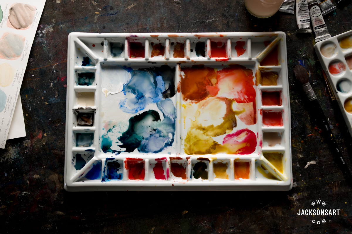
To replicate these pigments I specifically used Cobalt Blue, Indigo, Prussian Blue, Ivory Black (a substitute for Carbon Black), Rügen Chalk, Warm White, Red Ochre, Carmine (a substitute for Red Lake), Organic Vermilion, Yellow Ochre, New Gamboge, Stil de Grain (Dutch Pink), and Antique Rich Gold. To paint each of the following swatches, I worked on a Jackson’s 32 Well Porcelain Palette with Cover.
Colour Palette One – Blake’s Nocturnal Watercolours
Blake conjured chilling visions of the afterlife, divine threat, and spectral creatures in a number of works using a nocturnal palette. These works layer earthy reds and blues with greys and black, giving them sculptural weight. He notably used this palette in his Great Red Dragon series, which depicts the battle between good and evil from the Book of Revelation. The works characterise ‘a great red dragon, having seven heads and ten horns’ who threatens ‘a great wonder in heaven, a woman clothed with the sun, and the moon under her feet’. One work from the series, The Great Red Dragon and the Beast from the Sea, brilliantly displays Blake’s inventiveness in composition, with the dragon standing astride the sea demon, creating two powerful interlocking triangles.

William Blake
Pen and ink with watercolour over graphite, 40.1 x 35.6 cm | 15.8 x 14 in
National Gallery of Art
To recreate the palette of Blake’s nocturnal works, I used a very limited palette of Ivory Black (substitute for Carbon Black), Prussian Blue, and Red Ochre. On my sheet I demonstrated layering Prussian Blue and Red Ochre over Ivory Black, since many of his colours were mixed through layering rather than physical mixing. On the top right of the sheet I loosely mixed Red Ochre and Prussian Blue together, to replicate the mottled blue-browns of the shadows.

Next, I painted two gradients with both colours mixed with Ivory Black, to create the muted shades we see on the flesh and wings of the Dragon and Beast, and the nocturnal blues of the dresses in The Parable of the Wise and Foolish Virgins below.

William Blake
Watercolor, pen and black ink, brush and wash, over graphite, 36 × 33.2 cm | 14.2 x 13.1 in
The Metropolitan Museum of Art
Colour Palette Two – Songs of Innocence and of Experience, c. 1825

William Blake
Relief etching hand-coloured with watercolour and gold, 11.2 × 7.1 cm | 4.4 x 2.8 in
The Metropolitan Museum of Art
When Blake’s incredible works, Songs of Innocence and Experience, were brought together in one volume, he made this new title page for the book. In general, the pages share a jewel-like palette, with warm variations on primary colours, paired with some muted earth colours to compliment them. To recreate the palette of this page, I used – Cobalt Blue, Gamboge, Vermilion, and Ivory Black (substitute for Carbon Black), accentuated with Gold.

On my sheet I mixed Vermilion and Cobalt Blue together to create the muted burgundy that accentuates the Gold title. Then I mixed Vermilion and Gamboge together for the warm orange flames leaping over the figures. I mixed this bright orange with a touch of Ivory Black to create a darker yellow. Next I combined Vermilion and Ivory Black for the deeper tips of the flames. To recreate the figures’ soft peach and cool grey skin tones, I combined Vermilion and Gamboge, and then added a touch of Cobalt Blue, each diluted with water. For the muted blue sky peeking around the title, I mixed Cobalt Blue with Ivory Black, before adding a touch of Gamboge to the same mixture for the patch of grass the woman is splayed across.
Colour Palette Three – Pity, c. 1795

William Blake
Relief etching, printed in color and finished with pen and ink and watercolor, 42.2 x 52.7cm | 16.6 x 20.7 in
The Metropolitan Museum of Art
In 1795, Blake experimented with a new printmaking technique, using pigments bound in glue. After experimenting with pressing his designs in pure colour, sometimes painted directly onto unetched plates, each print was handcoloured with watercolour and delineated in pen and ink. This series of twelve works is amongst his most famous bodies of work, known for the bold characterisations of the end of times. In particular I’m drawn to Pity, which exists today in four distinct versions, including the one below, housed in the Yale Center for British Art, which has a warm terrene palette, in contrast with the crisp moonlit blues of the Metropolitan Museum of Art version above.

William Blake
Colour printed monotype, with watercolor, pen and black ink, and varnish on wove paper, 41.3 x 51.4 cm | 16.3 x 20.2 in
Yale Center for British Art
To recreate the palette of The Metropolitan Museum of Art version, I used Vermilion, Prussian Blue, Red Ochre, Chalk, Ivory Black (substitute for Carbon Black) and Yellow Ochre. For my first swatches I dabbed Ivory Black over a layer of dried Prussian Blue, to replicate the mottled blue-black of the sky the horses and riders surge through. Next I mixed Prussian Blue with Yellow Ochre for the soft grass. I experimented to achieve the translucent skin of the figures and the horses pale coat, by mixing Chalk into Vermilion and Yellow Ochre, and then diluting Prussian Blue mixed with Ivory Black. Next I layered Prussian Blue and Ivory Black on top of dried thin layers of Red Ochre, to recreate the shadows on the figures as they turn away from the light.

Colour Palette Four – Virgin and Child, c. 1818-26
Blake’s experiments with his misleadingly named ‘tempera’ technique (made with animal glue to adhere pigment) have a crepuscular quality with their rich tone and grainy texture. His Virgin and Child recalls early Christian mosaics and Byzantine paintings of the subject with its conventional composition and layers of gold detailing. The Virgin is serene and smiling, with gold tears rolling down her flushed cheeks, hands raised in exaltation to the starry night sky. Jesus mirrors his mothers pose, with a spiked halo glowing hazily at us through the darkness. Despite its reference to ancient art history – this Virgin and Child is made Blake’s own, with his cosmic interpretation of the subject.

William Blake
Tempera on panel, 28.6 × 23.5 cm | 11.3 x 9.3 in
Yale Center for British Art
Since the palette of this work has darkened over time because of the animal glue component, it’s difficult to replicate what the palette might have looked like originally. Instead, I made mixtures to recreate how it looks today, since I love its nocturnal quality. To recreate this palette I used a number of colours, combining, Prussian Blue, Indigo, Stil de Grain (Dutch Pink), Carmine (substitute for Red Lake), Gamboge, Ivory Black (substitute for Charcoal Black), Red Ochre, Chalk and Warm White.

I mixed a variety of colours along the bottom of my sheet, including Prussian Blue and Stil de Grain for the rich blue sky, Stil de Grain and Warm White for the golden stars, and then with a touch of Carmine for their flesh colour. The cool dappled combination of Chalk and Indigo recreated the Virgin’s robes, contrasted beautifully with the warmth of Gamboge and Red Ochre for the heat of Jesus’ holy crown.

Wonder and conviction are melded together in William Blake’s work to guide us toward our own enlightenment, through the embrace of the imaginary. His palette choices make different works range from opulent, to soothing, invigorating, and terrifying, with his innate gift for crafting atmosphere through colour. Himself and Catherine Blake’s diligent efforts to handcolour his prints, displays incredible dedication to the qualities of each of his mediums. The palettes they devised continue to transport us from the mundanity of life in the city – to the feverous marvel of the inner self, emotion, myth, religion, and nature.
Further Reading
Painting and Printmaking Techniques of the Brotherhood of The Ancients
A History of the Artist’s Book and How To Make Your Own
Film: A Guide to Watercolour Painting
Behind the Movement: Symbolism
Shop Art Materials on jacksonsart.com