

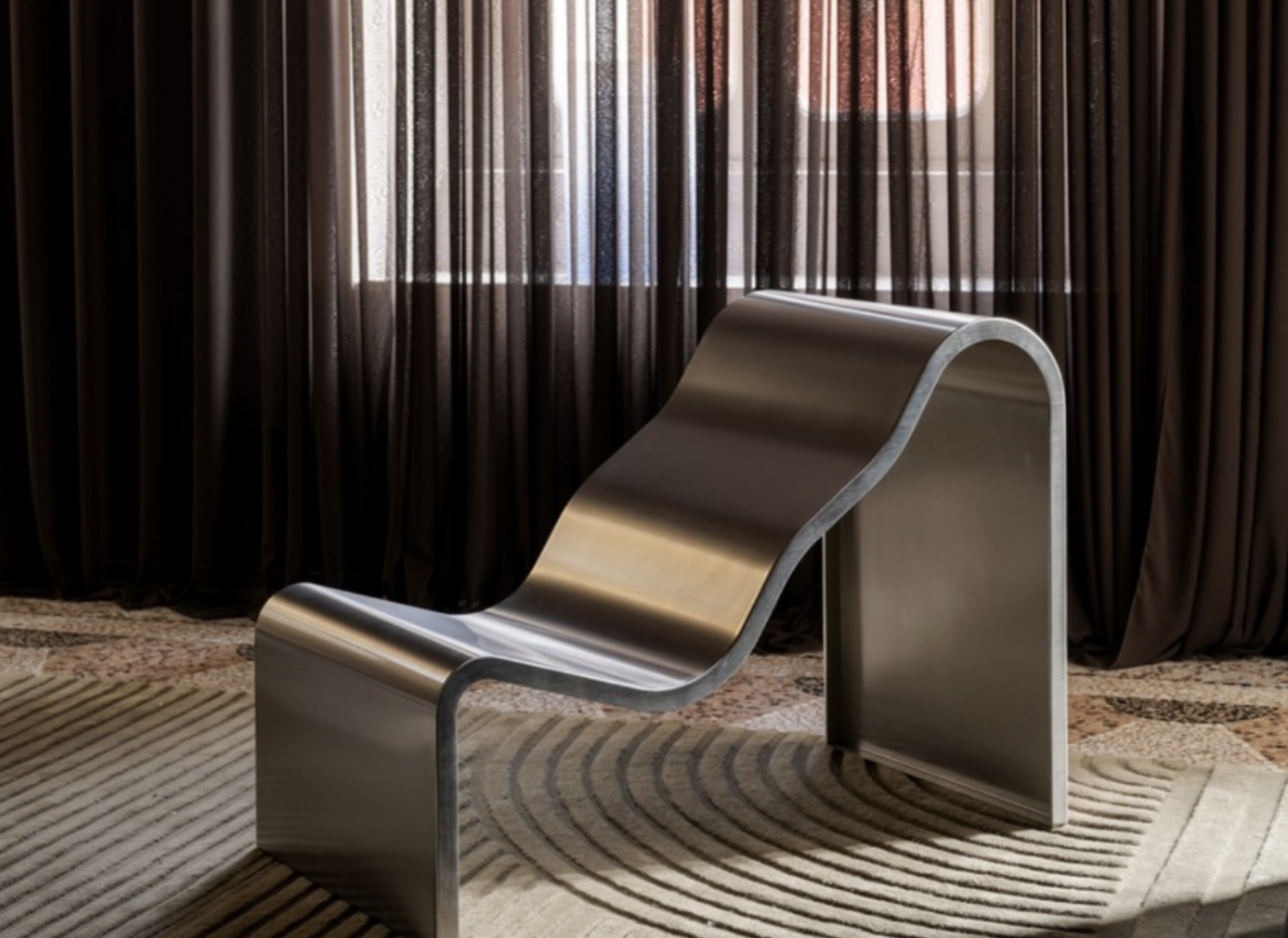
Trends are often communicated through short, catchy statements.Things like Chrome is back….Red is everywhere…
They may work as headlines and as good click catches, but they rarely tell us very much about what is actually changing, and also the risk is to flatten the knwoledge of things, of materials, of details….that are what makes the difference in design.
In fact, a colour, material or design element is never interesting simply because we start seeing it again, but what is interesting to know is why it is resonating now, how its meaning has changed, and the different ways we can adopt it.
This is the idea behind Taste Decoded, my new series I recently started on Substack at Travelling Taste.
Each article focuses on one colour, material or aesthetic direction and looks beyond the simplified trend label: observing its variations, references, applications and the wider shifts in taste surrounding it. Here a recap of the noted recently published.

01. Glass Blocks
Glass blocks are often discussed simply as another design comeback, strongly associated with 1980s interiors.
But their current use is much broader: from translucent partitions to curved walls, coloured compositions and architectural façades, designers are rediscovering glass blocks because they answer a very contemporary desire: creating separation without completely blocking light.
In the first Taste Decoded, I looked at the different ways this familiar material is being reinterpreted today.
→ Read Glass Blocks on Substack

02. Silver Metal
“Chrome is back” has probably become one of the most repeated interiors headlines of the last few years.
But silver metal today is not one single aesthetic: polished chrome, brushed aluminium, stainless steel, mirrored finishes, textured and fluted surfaces can create completely different atmospheres—from industrial and functional to futuristic, decorative or almost precious.
Looking at these variations tells us much more about changing taste than simply declaring the return of chrome.
→ Read Silver Metal on Substack

03. Deep Reds
Red is another colour that tends to be reduced to a trend statement.
Yet there is a significant difference between a bright primary red, a burgundy, an oxblood tone or a dark cherry red. Is so interesting to see how some colors that may look similar in the surface, actually when applied are giving a totally different vibe.
The deeper reds appearing across interiors today bring with them different associations: richness, intimacy, historical references and a certain visual weight that contrasts with the pale, neutral palettes that dominated much of the previous decade.
Taste Decoded looks at these nuances rather than treating “red” as one single direction.