


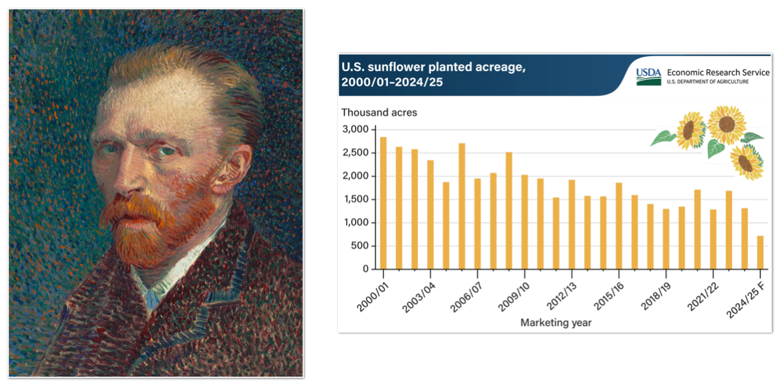
The bar chart requires a level of engagement and interpretation. The photograph of a person’s face hits immediately. It reaches you directly.
For those of us in the data game, the interpretation is second nature, so the abstraction doesn’t create friction. But for the people who don’t spent their time buried in spreadsheets, it can feel like a test.
Chip Heath and Karla Starr wrote a book called Making Numbers Count which is about the challenge of comprehending data. They share one particular example about the fact that most of the water in the world is undrinkable. The statistics can be hard to comprehend, but they become more accessible through a relatable example:
Before: Just 2.5% of the world’s water is unsalty, and over 99% of that is trapped in glaciers and snowfields. Only .025% of water is actually drinkable by humans and animals.
After: If the world’s water were put into a gallon jug, the humans would only be able to drink less than 20 drops of it (Starr and Heath, 58).
There are many clever techniques for helping people understand the numbers they are seeing. These are the things I have written about for years — intuitive visualizations, storytelling, comparisons, making numbers relatable, etc.
But as I mentioned in my previous post, I want to push past comprehension. You can understand a number perfectly and still feel nothing about it. Comprehension plus caring — that’s much closer to the whole thing. Caring is what focuses scattered attention on this number, and what makes decoding an abstraction worth the effort.
Which has left me with an important question:
What needs to be in place for people to care about a number?
That is what I will explore next.