


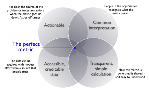
Step Two: Balance the Four Dimensions of a Good Metric
In my work with organizations over the years, I’ve noticed that weak metrics often fail in one of four key areas. Here’s a framework I still use regularly:
1. Common Interpretation
Everyone—from analysts to executives—should agree on what the metric means.
Quick example:
We once worked with a client who made a fuzzy distinction between “leads” and “prospects.” Prospects were supposedly more engaged… but no one could agree on how much more. That ambiguity led to internal miscommunication, confusion in reports, and a whole lot of finger-pointing.
Takeaway: If a metric requires a glossary entry, simplify it.
2. Actionability
Can someone take specific action based on this metric?
Example:
“Customer Satisfaction Score” might be useful, but if a frontline manager can’t tie it back to daily behavior or decisions, it doesn’t drive action. Actionable metrics link directly to activities your team can adjust.
3. Accessible, Credible Data
You might dream of a perfect metric, but if you can’t reliably collect the data, it’s a no-go.
Web analytics throwback:
“Unique visitors” used to be the gold standard—until cookie deletion and browser privacy controls made it an increasingly shaky foundation.
Today, we need to think about data availability, trustworthiness, and consistency across platforms. If your analytics stack doesn’t support the metric well, revisit the decision.
4. Transparent, Simple Calculation
If you need a PhD to explain the formula, you’ve already lost half your audience.
NFL fans love to debate quarterback ratings, but the math is notoriously convoluted. If a metric feels like it was invented to sound smart rather than be smart, that’s a red flag.
Remember: Simplicity builds trust. Especially on dashboards, where clarity is everything.
Step Three: Watch Out for These Metric Pitfalls
Even well-intentioned metrics can go sideways if you’re not careful. Here are some traps we’ve seen (and maybe fallen into ourselves):
Oversimplification
Compressing data into a single number might look clean, but it often hides meaningful variance.
Instead of showing a single “average,” try visualizing distributions or trends over time. This not only tells a more complete story—it encourages curiosity and conversation.
Edge Case Blindness
No metric is perfect. There will always be edge cases, exceptions, or weird outliers that don’t behave as expected.
That’s okay. Don’t throw out a useful metric just because it isn’t flawless.
The “Accountability Test”
Ask yourself: Could you hold someone accountable for this metric without them listing six reasons why it’s unfair?
If the answer is “no,” your metric might lack credibility or clarity.
Self-serving Bias
Let’s be honest—sometimes teams pick metrics that make them look good. It’s human nature. But it’s also dangerous.
A mature data culture favors truth over optics. When you choose metrics that reflect real progress (even if they’re not always flattering), you build trust—and better outcomes.
The Role of Data Storytelling
A great metric is more than just a number, it’s a narrative device.
When you pair the right metrics with clear, compelling data storytelling, you get alignment. You get buy-in. You get action.
Think of it this way:
At Juice Analytics, we’ve spent years helping teams move beyond static dashboards to create interactive, human-centered data products. (Here’s a look at our process, if you’re curious.)
We believe that when people understand their data, they make better decisions. Choosing the right metric is the first—and most crucial—step.
Final Thought: Metrics as Culture Builders
Metrics don’t just measure behavior—they shape it.
So choose metrics that:
-
Inspire the right actions
-
Build trust
-
Reflect your business goals
-
Make sense to real humans
That’s how you turn dashboards into decision tools, and analytics into actual business value.


