

For over 15 years, we’ve been living a paradox in the world of analytics.
On one hand, organizations have made massive investments in data infrastructure, cloud platforms, and BI tools. There’s no shortage of dashboards, reports, and models. Yet on the other hand, we keep hearing the same complaints:
-
“We can’t get people to use the data.”
-
“Our organization still doesn’t feel data-driven.”
-
“We’ve built so much… but nothing’s sticking.”
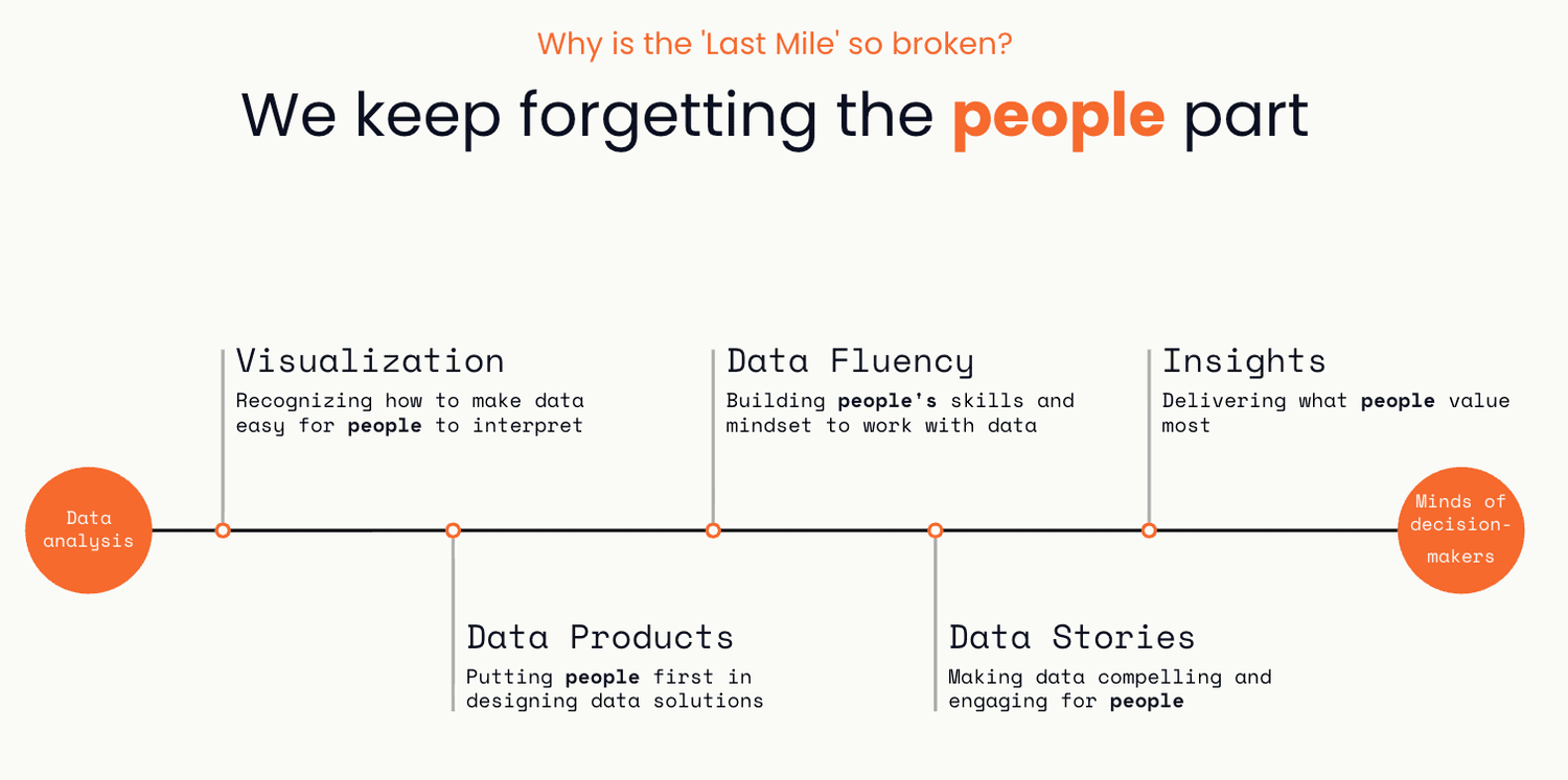
The problem isn’t in the data. It’s in the last mile—the critical gap between data analysis and human understanding. Bridging that mile is what transforms raw information into action. And it requires something we’ve undervalued for too long: communication.
This post explores the key breakdowns in the last mile, and how data professionals can fix them using better data visualization, storytelling, and product thinking.
The Analytics Investment That’s Missing
Most organizations don’t suffer from a lack of data. The real friction comes when trying to get that data in front of people in a way that clicks — where it actually influences decisions and drives behavior.
A recent BARC survey found that only 25% of employees actively use BI or analytics tools. That number has barely moved in the past seven years. Think about that. Despite all the dashboards, the insights aren’t landing.