
Grow Email Signups Without Popups: 7 Better Strategies

Visitors arrive for an answer, product, or resource—not another mailing list. Forcing overlay forms before delivering value alienates readers and risks search penalties. Luckily, you can grow email signups without popups by placing high-converting invitations directly where users are already paying attention.
Search engines prioritize user experience, distinguishing intrusive interstitials from smart design. By using contextual inline forms, dedicated landing pages, embedded hero boxes, and strategic sidebar calls-to-action, websites capture qualified leads without interrupting the reader. Start with non-disruptive, high-value placements to transform engaged visitors into long-term subscribers while protecting your site’s search visibility and usability.
What Most Email Signup Advice Gets Wrong
Changing the form will not fix a newsletter with no clear promise. Before adjusting its color, position, or button text, decide what subscribers will receive, who it is for, and how often it will arrive.
“Join our newsletter” says almost nothing. “Get one practical home-office guide every Friday” gives readers a subject and schedule. A store could offer specific restock alerts instead of vague “updates and offers.”
Do not judge a form only by submissions. Track signup sources, confirmations, early engagement, and quick unsubscribes. More addresses do not automatically create a more useful list.
1. Place Signup Forms Inside Relevant Content
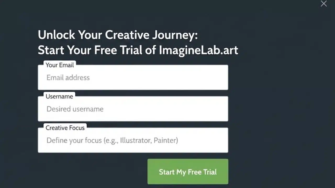
For most publishers and bloggers, an inline form is the strongest popup replacement. It sits within the page and can follow information that has already helped the reader.
Placement should follow intent. A form might appear after a substantial section of a long guide or at the end of an article. On a product category page, it could offer restock or new-arrival alerts. Dropping the same generic form halfway through every page may be non-intrusive, but it will still feel disconnected.
Match the offer to the subject. Someone reading an accessibility guide has a reason to request an accessibility checklist, not broad company news.
Ask for as little information as the first exchange requires. An email address is often enough. Use visible, properly associated field labels and clear error feedback; placeholder text alone disappears once typing begins and is not an adequate label.
2. Build a Dedicated Newsletter Landing Page
A newsletter page gives the offer room to explain itself and provides one stable link for social profiles, author pages, video descriptions, and email signatures.
State the subject, intended reader, expected frequency, and what happens after signup. If possible, show a representative issue or a limited archive. Readers should not have to provide an address before discovering whether they are joining an analysis newsletter, a sales list, or a collection of links.
Keep competing offers off the page. A focused landing page can grow email signups without popups because visitors arrive with context and can make a deliberate choice.
3. Offer a Resource That Solves the Next Problem
Many lead magnets are padded versions of the article a visitor has just read. That is a poor first exchange.
A better resource helps with the reader’s next task:
- A campaign worksheet after a guide to marketing calendars
- A working spreadsheet paired with a budgeting tutorial
- A short email course for a process too involved for one article
Specificity matters more than length. A one-page checklist can be more useful than a 40-page ebook.
Templates with old platform screens or outdated advice lose value quickly. Do not build a large resource library unless someone can review it. If the download also adds someone to ongoing marketing, disclose that beside the form.
4. Let Readers Preview the Email Before Subscribing
A signup box reveals little about the email behind it. Publish a representative issue, limited archive, or realistic excerpt rather than an unusually elaborate launch edition.
This is useful for specialist publications and brands that rely on editorial content. Put the form after the sample, state whether future issues are free or paid, and avoid hiding another sales pitch in the preview.
5. Add an Explicit Opt-In to Existing Customer Journeys
Checkout, account creation, appointment booking, and event registration are natural places to offer a subscription. They are also where businesses most often blur operational communication and marketing.
An order receipt is not blanket permission for promotional emails. Use a separate, unchecked choice with plain wording:
Email me product updates and occasional offers. The legal baseline varies. US CAN-SPAM regulates commercial messages and opt-outs without imposing a general prior opt-in rule. Canada generally requires express or qualifying implied consent. UK rules generally require consent unless a limited customer exception applies. EU requirements also combine electronic-marketing and data-protection rules.
For an international list, affirmative permission is the cleaner standard, but businesses should check the rules that apply to their audience. Keep consent records and provide a working unsubscribe method.
Double opt-in is a separate operational decision, not a universal legal requirement. It requires the address owner to click a confirmation link before becoming fully subscribed. That extra step can filter mistyped or unconfirmed entries, but a delayed or confusing confirmation email can also lose legitimate subscribers.
6. Give the Newsletter a Permanent Place on the Website
Give the newsletter a consistent home in the navigation, resource hub, author area, or footer. The footer is convenient but often undersold. Add the topic and frequency beside the field. Author pages are underrated because a reader may prefer one writer’s selection to a broad site newsletter.
Use one name consistently. Switching between “updates,” “insights,” “briefing,” and “email club” can make the placements look unrelated.
7. Create a Referral Path for Existing Subscribers
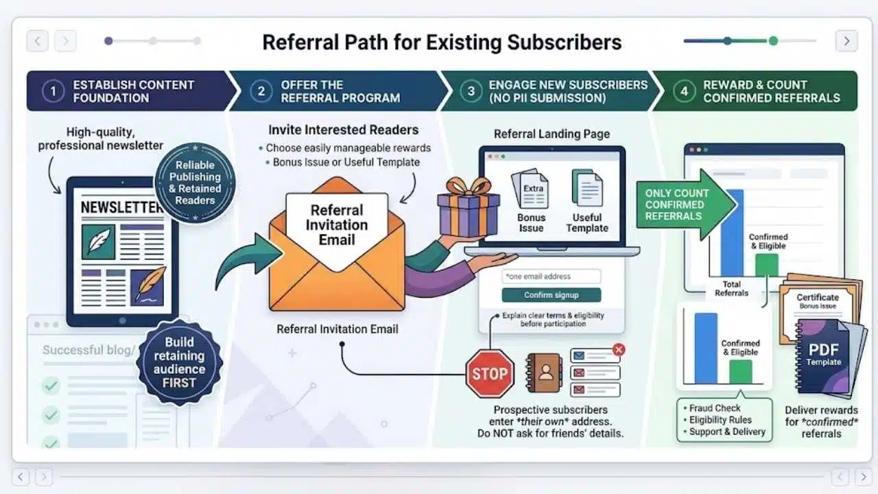
Referral programs are for newsletters that already publish reliably and retain interested readers. They are not an early fix for weak content.
Send prospective subscribers to a page where they review the offer and enter their own addresses. Do not ask readers to submit friends’ contact details. Be cautious about encouraging direct forwarding of marketing messages because some jurisdictions can treat marketer-encouraged forwarding as part of the marketing activity.
Rewards add tracking, fraud checks, eligibility rules, delivery, and support. A bonus issue or useful template may be easier to manage than merchandise. Count only confirmed, eligible referrals and explain the terms before asking subscribers to participate.
Final Thoughts
Start with one contextual form on a high-traffic page and one dedicated newsletter page. Test the complete journey on mobile and with a keyboard, including submission, confirmation, and the first welcome email.
Measure form starts, completed submissions, confirmed subscribers, and early engagement separately. GA4 can collect form_start and form_submit events, but custom and embedded forms should be tested. Use the email platform as the record of confirmed subscription status.
The practical way to grow email signups without popups is to earn the request after delivering value. A clear promise in the right place is more useful than another interruption.
Frequently Asked Questions (FAQs)
A small banner that leaves the main content accessible is different from a full-screen interstitial. Keep it compact, easy to dismiss, and usable on mobile. It should not cover navigation or force the visitor to interact before reading.
How many email signup forms should a page have?
There is no useful universal number. One well-placed contextual form may be enough on a short page. A long guide could justify a second invitation near the end, provided the two forms do not interrupt or repeat the same message too closely.
Should every website use double opt-in?
Not necessarily. It can confirm control of an address and filter unconfirmed entries, but it adds another step. Review local requirements, the quality of current signups, and whether confirmation emails reach subscribers reliably before choosing the workflow.